
Without an email preference page, someone who wants fewer of your emails can only put up with them or leave. An email preference center gives them a third choice. It is a page where people pick which of your emails they get and how often. Most guides stop at the page. Few say what has to happen behind it but we go beyond that.
Behind the page is where an email preference center can fail. If the tool that sends your emails never checks a saved choice first, the page breaks its own promise. People who can’t find an easy way to ask for less may press the spam button. Gmail’s limit on spam reports is tiny, just tenths of one percent.
The good news is that these problems are avoidable. This guide covers the page a business offers its own subscribers, not account settings. You will learn what belongs on it, what Gmail, Yahoo, and the law require, and how to check that every choice is followed. People who want less of your email get a way to stay, and you get a page that keeps its promises. We took each rule from its original source and checked where other guides’ numbers come from, so you know which claims hold up. Along the way, you will get five plain questions that show whether a page is real or just for show.
TL;DR
- An email preference center is a web page where subscribers choose topics, frequency, and sometimes channels, instead of choosing between everything and nothing.
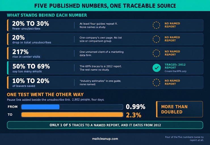
- Guides repeat a 20% to 30% unsubscribe cut with no study, yet in a pause test unsubscribing rose from 0.99% to 2.3%.
- Every page needs a control to stop all marketing email and an address fix, and an emailed link should open it without a password.
- Gmail requires one-click unsubscribe from senders past 5,000 daily messages, and a preferences page may sit beside that button but not replace it.
- Opt-outs must be honored within 10 business days under CAN-SPAM and CASL, but Gmail asks for 48 hours and Yahoo for 2 days.
- A saved choice counts only if the sending system checks it before every send, including scheduled emails and old imports.
What Is an Email Preference Center?
So, what is an email preference center? It’s a simple web page where a subscriber, meaning anyone who signed up for your emails, can choose what, when, and how often they want to receive. That usually means topics and how often, and sometimes a channel such as text messages. The page is also called an email preference page or a subscription center, and the choices are called email preferences.
Without one, a subscriber usually has only two options: keep getting everything, or leave your list. An email preference center adds a middle path, and a good one still keeps a clear way out.
How an Email Preference Center Differs From an Unsubscribe Page
A basic unsubscribe page does one job. Someone clicks the unsubscribe link, lands on that page, and it confirms they’re off your list. An email preference center gives the same person other choices, such as fewer emails or only the topics they like. Two plain terms describe the difference:
- Opt-out: the subscriber stops getting all emails from you.
- Opt-down: the subscriber keeps getting some emails, but fewer or different ones.
Here is how the two pages compare:
| Question | Basic unsubscribe page | Email preference center |
|---|---|---|
| What can the subscriber do? | Leave the list | Choose topics, how often, and channels, or leave |
| What does the business keep? | Nothing, because the person is gone | Some subscribers who might otherwise have left |
| What does the business learn? | Little, unless it asks why | What people want to receive, and how often |
| What does it take to build? | Very little | More work, because every choice has to be followed |
An unsubscribe page ends the relationship, while a center gives it a chance to continue on new terms. The catch is in the last row: a choice only helps if your system follows it. In practice the two sit side by side, and the center adds a second link for people who want something in between.
Email Preferences, Account Settings, and Consent Banners: Which Is Which
People use the phrase “email preferences” for several different things, but only one of these three is an email preference center.
| Thing | Who runs it | What it controls | Where you find it |
|---|---|---|---|
| Email preference center | One business, for its own emails | Which emails a subscriber gets from that business, and how often | A link near the bottom of that business’s emails |
| Account email settings | An app or website, for signed-in users | Which alerts and notices that account sends | The settings area after you log in |
| Cookie banner | A website, for its visitors | Whether the site may store cookies, small bits of information kept on your device | A pop-up or bar on your first visit |
The second sits behind a login. The third is about cookies, which have no say over which emails you receive. If you want to manage email preferences as a subscriber, look in the footer of that company’s emails for the link.
Benefits of an Email Preference Center
An email preference center helps two groups at once. Subscribers get control over what reaches their inbox, because they can manage email preferences themselves. You get a way to keep people you worked to earn, and a clearer picture of what each person wants.
| Benefit | Who gains | What changes |
|---|---|---|
| Choice and control | Subscribers | People decide what arrives and how often |
| Fewer full unsubscribes | Senders | Some people who wanted less choose fewer emails instead of leaving |
| Engagement and relevance | Both | Emails match what each person cares about, so more get read |
| Deliverability and complaints | Senders | Fewer people reach for the spam button just to get out |
| Segmentation and first-party data | Senders | Saved choices show which group each person belongs in |
| Compliance support | Senders | Choices can be changed or withdrawn in one clear place |
| Cleaner list | Senders | People can fix details, such as an address that changed |
Five of the seven benefits sit on the sender’s side, yet every one depends on a subscriber gaining first. If your page hides the exit or ignores a saved choice, your gains disappear with theirs.
Benefits of an Email Preference Center for Subscribers
Without an email preference center, a person who wants less email has three options. They can ignore it, unsubscribe from everything, or press the spam button, which counts against you. A center adds a fourth choice. When your subscribers can manage email preferences themselves, they keep what they value and turn down what they don’t. That brings four gains:
- Control over volume: people choose how many emails they get, so a busy week no longer pushes them to leave.
- Control over topics: people keep the emails that help them and skip the rest.
- Less clutter: a smaller, better-matched set is easier to notice and read.
- A sign of respect: a visible choice shows you care about the inbox you write into.
Benefits of an Email Preference Center for Senders
The benefits of an email preference center for you work like links in a chain. A person who wanted less stays, gets emails that fit better, and responds more. Fewer of them hit the spam button, and every saved choice tells you what to send next. If nobody can find the page, the chain never starts.
1. How an Email Preference Center Reduces Full Unsubscribes
A full unsubscribe means someone leaves your list for good. An email preference center offers another option at the moment they feel like leaving: they can change their email preferences instead. People often leave because one specific thing bothers them, and each has a matching choice on the page.
| Reason people leave | What the page can offer |
|---|---|
| Too many emails | A lower frequency, such as weekly instead of daily |
| Emails that feel off-topic | Topic choices, so they keep some emails and skip others |
| A change in their situation | New topics, or a new address, such as a work inbox in place of a personal one |
Each row is opt-down at work: a person who might have left stays, on terms that suit them. A frequency choice only works if you back it with real emails.
No page can promise a number, and someone who changed careers or never wanted your emails will still leave. To see whether the page is keeping people, track how many of those who click unsubscribe end up staying. One email platform calls this the reclaim rate.
2. How an Email Preference Center Improves Engagement and Relevance
Engagement is how much people read and act on your emails, through clicks, replies, and purchases. Relevance means an email matches what the person wants right now. The two go together. A subscriber saves their email preferences in your email preference center, and you send what they picked. More of what lands in their inbox is useful, so they tend to click, reply, or buy more.
A note on opens: clicks and replies are the clearest signs of engagement in your reports. Opens are less reliable, and Apple Mail Privacy Protection is one reason. It can make an email count as opened even when nobody read it.
There is one more catch. People who use your page may already like your emails more than the average subscriber. So a rise in clicks does not prove the page caused it. A fairer comparison sets people who used the page against similar subscribers who didn’t, over the same weeks.
3. How an Email Preference Center Affects Deliverability and Complaints
Deliverability is whether your emails reach the inbox instead of the spam folder. A mailbox provider, such as Gmail, makes that call. Gmail’s guidance for senders who email thousands of its users a day tracks the user-reported spam rate. That rate comes from people marking your emails as spam.
An unsubscribe tells you someone is leaving. A spam report tells their mailbox provider your email is unwanted. Google says easy unsubscribing helps keep spam rates low, and lower spam rates mean better delivery. It also says recipients report unwanted emails as spam more often when there is no easy way out. An email preference center follows the same logic. A person who wants less mail but can’t find a way to manage email preferences has one button left to press.
What a center can’t fix: dead addresses, emails sent to people who never asked for them, and missing email authentication on your side.
A center also works alongside the one-click unsubscribe that Gmail requires large senders to offer on marketing emails. If you send at that scale, Gmail shows it as a button next to your sender name. A link to a preferences page can sit in the email too, but on its own it doesn’t meet that requirement.
Gmail’s spam-rate limits are measured in tenths of one percent. A detailed look at those limits, and at what happens when a sender crosses them, is in the dedicated post on spam complaint rate.
4. Segmentation and First-Party Data From Email Preferences
Segmentation means splitting your list into groups, so each group gets emails that fit it. One of the simplest ways to get that information is an email preference center, where people set email preferences and tell you directly. Two kinds of data matter. First-party data is what you learn by watching what people do, such as which links they click. Zero-party data is what a person chooses to tell you on purpose, such as the topics they pick on an email preference page.
Zero-party data is useful because you don’t have to guess. A person who picks “product news, monthly” has told you which group they belong in, and now expects monthly product news. Treat each choice as a strong hint, though, because people sometimes pick the wrong option. Email segmentation goes further, covering the main types of segments, strategies for each, and real examples.
What the Published Numbers on an Email Preference Center Actually Show
Most guides to email preference center best practices start with a big number, such as 30% fewer unsubscribes. Ask three questions before you trust one: who measured it, on whom and for how long, and whether you can find the source. A company reporting its own result has a reason to look good. A real result names how many people were measured and a comparison group. “Industry benchmarks” gives you nothing to check.
Here are the five numbers you will meet most often.
| Number as repeated | Where it comes from | How we treat it |
|---|---|---|
| Unsubscribes fall by up to 30%, or 20% to 30% | At least four guides repeat it. None names a study | Unsourced, so we skip it |
| Total unsubscribes down by 20% | SendGrid, an email delivery company, on its own page, with no list size or comparison group | One company’s experience |
| A 217% rise in email preference center visits | One unnamed client of a marketing data firm | Visits aren’t retention, so we skip it |
| Top reason to unsubscribe: 83% say irrelevant content, while 50% to 69% say too many emails | The 69% traces to a 2012 report. The rest name no study | One dated report, so we don’t rank reasons |
| An opt-down option saves 10% to 20% of people about to leave | “Industry estimates” in one guide, with none named | Unsourced, so we leave it out |
We could trace only one of the five numbers to a named report, and it dates from 2012.
Published numbers can point the other way too. A fundraising testing firm added a pause link beside the unsubscribe link for one group. Across 2,802 people over four days, the unsubscribe rate went from 0.99% to 2.3%. An email coding platform offered a pause option for over a year. It reports that 98% of the people who could pause chose to unsubscribe instead, and it then removed the option. Each covers one audience and is small, so test a pause option before you rely on it.
A quick sense check: a percentage depends on what it is a percentage of. Say 20 of every 10,000 people you email unsubscribe from a send. A 30% drop means 14 instead of 20, which is six fewer. Until you have before-and-after numbers from your own list, measured once people can manage email preferences, treat these numbers as stories about other companies.
Email Preference Center Types
An email preference center is defined by what it lets a person control. That can be when you write, what you write about, where you reach them, and what you know about them. Real centers often blend these, which is why guides count the types differently. Your choice of type shapes your email preference center design more than any layout decision. It decides what the page promises and what you must deliver.
| Type | What the subscriber controls | What your system must enforce |
|---|---|---|
| Time-based | How often emails arrive, and whether to pause | A frequency setting for each person, and a resume date for each pause |
| Content-based | Which topics they receive | A topic label on every email, checked against each person’s choices |
| Multi-channel | Which channels reach them, such as email, text, or push | A separate permission and do-not-send list for each channel |
| Hybrid | Topics and frequency together, sometimes channels too | A clear order of priority when choices overlap |
| Profile and zero-party data | Details they share, such as interests, location, or sizes | A reason for every field, stored apart from permission records |
1. Time-Based Email Preference Center
A time-based email preference center lets people control when and how often you email them, usually through a lower frequency or a pause. It suits senders who email often. Three promises sit behind the page:
- A setting for each person: a blanket cap treats everyone the same, so store each subscriber’s choice on their own record.
- A rule for emails outside the limit: decide whether a capped email is skipped, delayed, or folded into a digest.
- A resume date for every pause: a pause with no end is an unsubscribe in disguise.
Time-based controls change how often people hear from you, but not what they hear about.
2. Content-Based Email Preference Center
A content-based email preference center lets people manage email preferences by subject. You offer a short list of topics, such as product news, tutorials, offers, and events, and each person keeps the ones they want. It fits senders whose emails serve different readers.
Every topic is a promise. Give each email one topic, and make your sending tool refuse to send it to anyone who turned that topic off. Offer only topics you can target. A topic list controls what people get, not how much, so someone who picks two busy topics may still leave over volume.
3. Multi-Channel Email Preference Center
A multi-channel email preference center lets people choose where you reach them: email, text messages, or push notifications. It fits senders who already message on more than one channel. Each channel keeps its own permission, tied to its own contact detail:
- Email permission follows the address: some systems store status against the address, so it can survive deleting and recreating a contact.
- Text permission follows the phone number: US rules describe consent for texts as given for a particular number.
- Each channel has its own do-not-send list: someone who replies STOP to a text has ended the texts. They haven’t ended the emails unless they say so.
Texts also fall under the Telephone Consumer Protection Act in the US.
4. Hybrid Email Preference Center
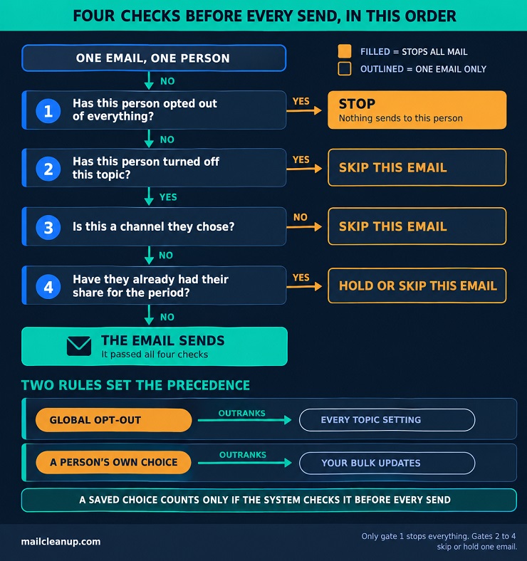
A hybrid email preference center combines controls, so people can set several email preferences in one place. More controls mean more chances for choices to collide. Before every send, we would have your system run four checks in order:
- Has this person opted out of everything? If so, stop.
- Has this person turned off this topic? If so, you skip the email.
- Is this a channel they chose? If not, skip it.
- Have they already had their share for the period? If so, you hold or skip.
Two rules keep conflicts honest. A global opt-out outranks every topic setting, and a person’s own choice outranks your bulk updates. Define what “all” means: with several brands, “unsubscribe from all” can mean one brand’s emails or every brand’s. Decide, say so on the page, and make your system match.
5. Profile and Zero-Party Data Email Preference Center
A profile email preference center goes beyond permission. It asks people to share details, such as interests, location, or sizes, so you can tailor what you send. These details are zero-party data, which people choose to give you on purpose. Three habits keep it honest:
- A purpose for every field: UK law calls this data minimization. Hold only the data that bears on your purpose, and no more than you need.
- Details kept apart from permission: a saved interest shows what a person likes, not that they agreed to hear from you.
- A way to fix and remove details: people can ask you to complete incomplete data and to delete data you don’t need.
It is the heaviest type to maintain, so it often works best as a layer on top of another.
How to Choose the Right Email Preference Center Type
Email preference center best practices only help once you know which type you are building. Start from the problem you are solving, and check what your system can enforce before you promise anything:
- Unsubscribe feedback points to volume: start with time-based controls.
- It points to emails that don’t fit, or you send several kinds: start with content-based controls.
- You already reach people by text or push: add channel choices, each with its own permission record.
- You run several streams for a varied audience: combine topics and frequency, and write the order of priority first.
- You personalize with details such as size or region: add profile fields only when you have a use for them.
If you are unsure, choose the most complex type your system can enforce today. An option you can’t honor costs more trust than a missing one.
What to Include in an Email Preference Center
An email preference center is a list of promises, and every control you add is another one. Run a one-change test before you add a control: switch one setting on the page, then check whether your next send honors it. If it doesn’t, the control isn’t ready.
Two controls belong on every page. One is a clear way to stop all marketing email. US law lets you offer a menu of message types, but the menu must still include a way to stop all marketing from you. The other is a way to correct the email address, because a stale address ends the relationship without anyone deciding to end it. Add topics and frequency next, because they answer relevance and volume, the two problems the page exists to solve. Everything else waits until you have a use for it.
Topic and Content Controls in an Email Preference Center
Wording does most of the work in email preference center design, and nowhere more than in a topic list. A subscriber sees a label, guesses what arrives under it, and ticks or unticks, so make that guess easy. Here are four labels we would rewrite on sight:
| Weak label | What goes wrong | Stronger label |
|---|---|---|
| Updates | It doesn’t say updates about what | Product updates |
| Marketing | It names a department, not a topic, and sounds like a pitch | Offers and sales |
| Insights | Readers can’t picture the email | Industry report |
| Other | It isn’t a topic at all | Cut it, or split it into real topics |
Name the contents, not the sender’s department. Put one line under every label saying what arrives and how often, such as “Product updates: new features and fixes, about once a month.” Offer a select-all shortcut, not an “Everything” topic. Show your returning subscribers their current choices so they can manage email preferences without starting over. Decide what “no choice recorded” means for each topic, and write it down, because that group can be most of your list.
Frequency and Pause Choices for Email Preferences
Every email preference center needs a way to turn the volume down short of leaving. Name each choice after what people get, not a count you may need to change. “Two emails a week” becomes false the day you add a third, while “Weekly roundup” stays true. Three tiers are enough to start: the full stream, a digest, and a quiet tier for major news only.
Offer two pause lengths, such as 30 and 90 days, and show the restart date on the confirmation. Promotions pause, and we would pause automated marketing too, because a cart reminder during a pause feels like a broken promise. Service messages continue. Default everyone to the pace you promised at sign-up. How often to send overall is discussed in detail in the dedicated post on [email frequency].
Channel and Format Choices on the Email Preference Page
Show a person only the channels you can actually use for them. In an email preference center, a text option makes sense when you hold their phone number and have their permission to text it. A push option makes sense when they use your app. A new channel never inherits another channel’s yes, so its box starts unticked.
Push has two locks: your page records that someone wants notifications, but the device holds the permission. On iPhones an app needs the person’s permission before it can alert them. On new Android installs from version 13, notifications start off until the person allows them. So put push controls inside the app, and on the page point people to its notification settings.
Format is the other choice. A format preference tells you to send only the plain-text version of an email to that person. That works only if every email has a plain-text version written to be read.
Profile Fields and Progressive Profiling in an Email Preference Center
A profile field earns its place in an email preference center when its answer changes what you send next. If you can’t name the email that would change, don’t ask yet. Region, language, birthday month, role, and size or fit earn their place only when offers, content, or a birthday email depend on them.
Progressive profiling means asking for one detail at a time, over several visits, instead of one long form. Ask for the first detail at sign-up, and the next once the person has a reason to trust you, such as a first order.
Fields to avoid: UK law gives some kinds of data extra protection. They include race or ethnic origin, politics, religion or beliefs, union membership, health, sex life, and sexual orientation. The UK regulator adds that guesses count too. A “dietary needs” field can point to health or religion, so unless an email can’t work without the answer, leave such fields out.
A declared field tells you what a person says, not what they do. The four levels of personalization are worked through in our dedicated email personalization guide. We would let what a person says control permission and topics, and let behavior suggest but never override.
Keeping Required Service Messages Out of Email Preferences
Some emails aren’t marketing. Receipts, shipping updates, password resets, security alerts, billing notices, and changes to your terms exist to run an account or finish a purchase. A person’s email preferences should cover optional email only. An email preference center shouldn’t offer to switch these messages off, and a global opt-out shouldn’t touch them.
In the US, the FTC draws this line narrowly. Its CAN-SPAM guide lists five kinds of “transactional or relationship” message. The examples are ours.
| Kind of message | Typical examples |
|---|---|
| Completes or confirms a deal the person agreed to | Order confirmations, receipts |
| A recall, warranty, safety, or security problem with something they bought | Recall notices, security alerts |
| Changes to an account, membership, or subscription, or regular balance information | Terms updates, plan changes, statements |
| Notices about someone’s job or its benefits | Benefits notices |
| Delivers goods or services the person agreed to | Download links, e-tickets |
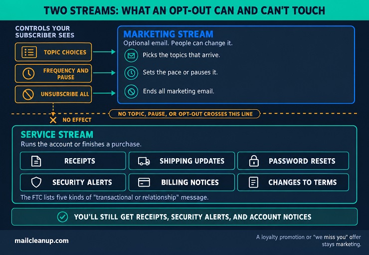
The FTC adds that the law reads these kinds narrowly. Being a subscriber or member doesn’t make every message a service message, so your loyalty promotion or “we miss you” offer stays marketing. Mixed emails: one that carries both kinds of content counts as commercial in two cases. One is when a reader would take the subject line as an ad. The other is when the service content isn’t mainly at the start. A commercial email must honor opt-outs.
Three habits keep the line clear. Tag service emails as their own stream that no topic, pause, or opt-out can touch. Keep your promotions out of them. And put a line beside the pause and unsubscribe-all controls, such as “You’ll still get receipts, security alerts, and account notices.”
Industry, Holiday, and Seasonal Options for Email Preferences
The right options depend on what you send, so treat these email preference center examples as starting points to adapt. A store might offer new arrivals, sales, and back-in-stock alerts, and a software company product updates, tutorials, and events. A B2B sender should keep choices per person, not per company, so one colleague’s opt-out doesn’t silence another. Almost everywhere, keep order, billing, and booking messages outside the options.
Seasonal options are pauses with a built-in end date. Some brands let people skip Mother’s Day and Father’s Day emails, and sale seasons are another candidate. An occasion opt-out needs a tag on each occasion email, a date window, and a standing option announced early. Add a line saying you will still send everything else. At least one retailer had to switch email tools to offer it, so check what your system can do first.
Email Preference Center Best Practices
Email preference center best practices begin with the visitor, a person who clicked through from an email to change one thing or to leave. That visitor did not come to explore, so every element you add costs them something. We judge a page by four tests, each a question the visitor silently asks.
| Test | The visitor’s question | What passing looks like |
|---|---|---|
| Recognizable | Is this really the sender’s page? | The sender’s name and look, a web address people recognize, a secure connection, and the address being edited |
| Quick | Can I do this with my thumb? | One page, a short list of choices, large tap targets, and plain words |
| Reachable | Do I have to log in? | The link in the email takes that person straight to their own settings, with no password |
| Conclusive | Did it work? | A message that names what changed and when it takes effect |
Only one test concerns the choices on your page. The other three decide whether a visitor trusts the page, can reach it, and believes the result.
Email Preference Center Design: Layout, Copy, and Mobile
Good email preference center design removes work. Every extra field, option, and sentence is something a visitor must read and weigh before doing the one thing they came for. We design to one rule: make the path from “change this” to “it’s changed” as short as possible.
Layout for the Email Preference Page
Keep your email preference center to one page, because a preference change is a small task. Add a step only when you need a second answer that depends on the first, such as a phone number after someone picks text.
| Zone | What goes in it | The rule |
|---|---|---|
| Top | The sender’s name or logo, a plain page title, and the address being edited | Say whose page this is and which address it covers |
| Middle | The choices, grouped under short headings | One column, one choice per row, label and description together |
| Actions | Save, then the stop-all control | Save is the only primary button. Keep stop-all visible but apart from it |
| Foot | A link to your privacy notice and a way to contact you | Keep it small so nothing competes with the choices |
Leave out banners, promotions, and social links. Anything that isn’t identity, a choice, or an action gives your visitor a reason to wander.
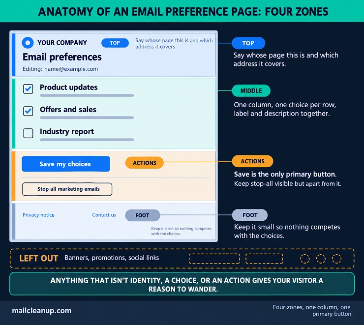
Pick one saving model and tell people which it is. Usability research says a switch should take effect the moment it is flipped. A control that waits for a Save button should be a checkbox. Mixing the two leaves visitors unsure whether a change took effect. We would start with checkboxes and one Save button, because one confirmation can then describe everything that changed. Show frequency tiers as radio buttons, since a person can pick only one. Place Save straight after the last choice, and keep your stop-all link easy to find but hard to hit by accident.
Copy and Microcopy That Help Subscribers Manage Email Preferences
Most words on your email preference center are not topic labels. They are the headline, the intro line, the buttons, the stop-all link, and the offer before someone leaves. This small text is called microcopy. Each piece should say what happens when the visitor acts, in the visitor’s own words. That lets your visitors manage email preferences without a second thought. Five pieces carry most of the weight:
- The headline: name the page in plain words, such as “Your email preferences”.
- The intro line: one sentence on what the page does and whose settings it covers, such as “Choose what you hear from us. These choices apply to [email protected].”
- The checkbox labels: start with the keyword and avoid questions, so “Product news” beats “Do you want news about our products?”
- The Save button: use a verb and an object, such as “Save my choices”, not a bare “Submit”.
- The stop-all link: name what stops, such as “Stop all marketing emails”, because a bare “Unsubscribe” can leave people guessing.
Write like a helpful person at a counter, not a retention team. Skip guilt and pleading, because a visitor who feels pushed may hit the spam button instead. If you show an alternative before an exit, give it one line, such as “Too many emails? Get one a month instead”, and keep the stop-all link beside it. A line beside Save, such as “You can change these any time”, lowers the cost of picking wrong.
Mobile and Accessibility for an Email Preference Center
Plan your email preference center for a small touchscreen, because the link sits in an email and email is read on phones. The same choices that help a thumb also help people who use a keyboard, a screen reader, or a zoomed view. The W3C’s accessibility guidelines give you checkable numbers for most of them:
- Tap targets: make your Save and stop-all controls about 44 pixels square, with space between them. The W3C sets 24 pixels as the minimum and 44 as the stricter level.
- Zoom: text should grow to 200% with nothing cut off, so zoom in and check that every control still works.
- Contrast: normal text needs 4.5:1 contrast against its background, so check your pale grey description lines first.
- Labels and groups: tie each label to its control so tapping the words ticks the box. Give each group of choices a short heading.
- Keyboard: tab through the whole page without a mouse, and make sure Save is reachable.
Two more details trip up teams. Don’t rely on color alone to show a topic is on, so add a checkmark or a word. And start your page title with what the page is, such as “Email preferences”, because screen readers announce the title first.
Where to Host the Email Preference Page
Host the page where a visitor will recognize the address. Where your email preference center lives matters as much as how it looks. Visitors judge the page before they read a word of it. The first thing they see is the web address. A name they know says the page belongs to you, and an unfamiliar one can look like a stranger asking for details. Match the look to the email, with the same name, logo, and colors.
You have three places to put it:
| Where it lives | What visitors see | The trade-off |
|---|---|---|
| The sending platform’s own domain | A name that belongs to the platform | Works at once, but the address isn’t yours |
| The platform’s page on an address of yours, such as preferences.example.com | Your own domain | A familiar name with the platform still doing the work, though some platforms charge for it |
| Your own site | Your domain and your own page | Full control, and you maintain it, including how choices reach the sending system |
The middle option is the usual compromise. Some platforms serve their email preference pages from their own domain by default, so check which row you are in today.
A secure connection: load the page over HTTPS, the padlock in the address bar. A major browser began marking pages without one “not secure” in 2018, and platforms differ on who sets it up.
Old links that keep working: emails sit in inboxes long after the send. Use an address you own, and send visitors from any retired page to its replacement.
Before you commit to a platform, ask three questions:
- Address: can the page run on an address you own?
- Secure connection: who sets it up and renews it?
- Records: can you export each person’s choices with the date and source? Where consent is your basis, you need records showing that someone agreed.
Letting Subscribers Manage Email Preferences Without a Password
Let your subscribers manage email preferences straight from the email, with no password. A login wall is a poor fit for an email preference center, which people open rarely and in a hurry. Usability research reports that people are rarely more annoyed than at a login wall, and that typing credentials on a phone is hard. A visitor who can’t recall a password may give up, and the next click may be the spam button.
What the rules say: in the US, an opt-out can’t need more than a reply or one page visit. It also can’t need personal details beyond an email address. In the EU and UK, where consent is the basis, withdrawing it must be as easy as giving it. If joining took one email address, leaving shouldn’t take a password.
The alternative is a link made for one person on your list. Each email carries a link with an identifier unique to that subscriber, and your system can check that nobody has altered it. Clicking it opens that person’s settings directly. The link proves one thing: the click came from an email you sent to that address. Give it the care of a password-reset link, with a long random identifier, a secure connection, and limits on repeated attempts. Trust it no further than that.
Decide what your link unlocks, then draw the line there:
| What the visitor wants | Does it need a login? | Why |
|---|---|---|
| Stop or change marketing email | No | The worst case is a changed newsletter choice |
| Change the email address | A confirmation, not a login | A code sent to the new address proves the person controls it |
| See orders, billing, or saved payment details | Yes | That data is personal, and a forwarded email shouldn’t reach it |
Never make a login the only route to stopping marketing email. Where you have accounts, offer preferences inside the account as well, and keep the email link as the route out.
Confirmation and Error States in an Email Preference Center
An email preference center is not finished when the visitor taps Save. It is finished when they can see exactly what changed in their email preferences. The W3C’s forms guidance says notifications should be short and clear, and that success messages confirm the task is done. Six states need a message of their own, and you should write all six before launch:
| State | The message says |
|---|---|
| Saved | “Saved. You’ll get Tutorials and Events. Offers are off.” |
| Nothing changed | “No changes to save. Your choices are the same as before.” |
| Saved twice | The same words as the first save |
| Link expired | “This link has expired. Enter your email address and we’ll send a new one.” |
| Save failed | “Sorry, that didn’t save. Your choices are still here. Please try again.” |
| Change near a queued send | “An email already scheduled may still arrive. Everything after it follows your new choices.” |
Only one of the six is a plain “Saved”. The other five are where an email preference center gains or loses trust. Three habits make the states work:
- Name what changed: list the topics now on or off, in your visitors’ words. A bare “Preferences updated” leaves people unsure which change was saved.
- Say when it applies: promise only what your system does at send time. A campaign scheduled before the change may still go out.
- Keep the choices after an error: list errors at the top, name each field, and say how to fix it. Never make visitors re-enter what they already chose, and mark messages so screen readers announce them.
If your links expire, don’t leave a dead end. Say so and offer one action: enter an address, get a new link. Show the same message whether or not the address is on your list, so the form can’t reveal who subscribes. And don’t let a link that carries an opt-out expire sooner than 30 days after the send, which is the US minimum.
Email Preference Center Examples
Real senders show how the choices on an email preference page get built. These email preference center examples come from pages the senders published themselves. Each is either the page where people set choices or the sender’s own help or announcement page about it. All were read in October 2026. Each example tells you what the sender does, what you can copy, and what to watch for. Where a page doesn’t say something, the example doesn’t either.
Email Preference Center Examples With Frequency and Pause Controls
Pace controls answer three separate questions. How often should a subscriber hear from you? How long should a break last? Which of your mail ignores the answer? Email preference center design can give each question its own control. The five senders here handle them in different ways.
Hogan Lovells Cadwalader: the alerts tab splits pace into two controls. One sets how often regular alerts arrive: Never, Daily, Weekly, Fortnightly, or Monthly. A separate checkbox turns on instant alerts for urgent developments, and the page says some topics come only that way. You can copy the split between routine and urgent mail, and the page’s note that changes take a few business days. Keep a Never choice and your full opt-out as separate controls, so choosing no regular alerts isn’t the same act as leaving.
AIHA: this membership group’s announcement describes a pause for all of its email. The pause comes in lengths of 7 days, 14 days, or 30 days, alongside a choice of which content to receive. Members and customers reach the center from a footer link or from their profile after logging in. You can copy the short list of fixed pause lengths, which you can store as an end date. Because the pause covers all email, a stream that must keep flowing needs its own rule in your system.
Bath & Body Works: its help article says the footer link in an email leads to a page with two controls. A dropdown sets how often visitors hear from the brand, and a Submit button saves it. A separate Unsubscribe button stops email completely, and the article doesn’t list the dropdown’s options. You can copy the pairing of one pace control with one separate exit. Offer only the paces your system can keep, because each option is a promise.
Hip: this marketplace’s help page says members set their email preferences, including frequency, for each type of email. The types include site newsletters and new listings for favorite stores, a want list, and followed searches. Followed searches can also be switched off one at a time. Other types cover auctions ending soon, new bids, and recently viewed listings. Order and system notifications can’t be disabled, and emails from individual sellers sit outside the page. You can copy frequency per alert type, which suits mail triggered by behavior. Copy the line about what can’t be switched off, and name any mail your own page doesn’t control.
Unbiased: its help center describes one personal footer link in a marketing email. Through it, people pick the types of email they get, cut how often the company writes, or unsubscribe from marketing email. The page also says marketing email can be paused, and that essential service messages, such as enquiry confirmations, may still arrive. It adds that changes usually apply shortly. It tells people who can’t update the page to email from the address they signed up with. You can copy the service-message line and the help route. Replace “shortly” with a time your system can keep.
Between them, the five pages make four decisions:
| Decision | Options seen in these pages | What it commits you to |
|---|---|---|
| How often | A short list of cadences, a dropdown, or a cadence for each alert type | Sending at that pace to everyone who chose it |
| How long | Fixed pause lengths, from 7 days to 30 days | Restarting mail on the end date without anyone asking |
| What ignores the pace | A separate instant-alert checkbox, and order or service messages that can’t be switched off | Naming that mail on the page |
| Leaving | An Unsubscribe button beside the cadence control, and a full opt-out kept apart from Never | Treating a quiet inbox and a departure as different states |
Pick the rows your sending system can enforce at send time. A control the system can’t honor misleads the visitor. Keep your list of exceptions short, and write it on the page.
Topic and Category Examples on an Email Preference Page
Topic choices let a subscriber manage email preferences without leaving your list. Your subscribers keep the mail they want and drop the rest. In an email preference center, the labels do most of the work, because each label is what the visitor chooses from. The five senders here label, group, and gate their topics in ways you can compare.
Dictionary.com: its help article names some of the kinds of email it sends. They include a daily word, editorial pieces, quizzes, writing tips, and product updates. The Manage Preferences link in the footer leads to a page where people remove themselves from individual types. The Unsubscribe link leads to a management page with a Stop All Emails button. You can copy topic names that say what the email is. Copy the pair of footer links too, one for choosing topics and one for unsubscribing. The article doesn’t say what a person sees after saving, so confirm every change on screen in your own page.
AO Foundation: its announcement from October 2025 says the footer link is worded as a question about what the person wants to hear. The link leads to a topic list that appears only for people with an account who are opted in. Each topic turns on or off with one click. Someone who is opted out must opt in again first, and someone without an account must create one. You can copy the one-click toggles. Leave out the account and opt-in gates, because each puts a step between your subscriber and the choice.
NHPCO: its guide says people log in, open their profile, and choose from a list of categories. A Save button sits at the foot of the page, and each category has a one-line description. Several descriptions give the pace: monthly job openings, a weekly member newsletter, quarterly pediatric journal alerts, and occasional partner outreach. You can copy the pace written beside each label. Copy the separate category for partner mail too, which people can then refuse on its own, and skip the login for your marketing choices.
The MLC: its help page says the Manage Preferences link in a marketing email leads to an email preference page of categories. People select what they want and save. The option to leave every list sits at the bottom of that page and needs a separate save click. The page names the mail that continues afterward: royalty statements, portal updates, and legally required notices. It also offers help from its support team to people who can’t make the changes themselves. You can copy the named examples of mail that continues, and the support route. Keep your stop-all control visible without scrolling.
Hogan Lovells Cadwalader: the topics tab groups choices two ways, by industry and by issue. Child topics nest under their parents, and a select-all box sits at the top. Languages and countries get their own tabs, each with a select-all. A prompt asks whether to keep or discard unsaved changes when a visitor leaves. You can copy the select-all and the unsaved-changes prompt for any list that runs past one screen. Skip the extra nesting unless your audience needs it, because each level adds a click.
Four email preference center best practices follow from these pages:
- Labels: name each topic for what the email is, in words your subscribers would use.
- Pace: write how often each topic sends beside its label, so the choice is informed.
- Partner mail: give sponsor or partner mail its own topic, so people can refuse it alone.
- Access: let people reach topic choices from the email without an account. Don’t make them opt in a second time first.
Profile and Zero-Party Data Examples in an Email Preference Center
Some email preference center examples ask for more than choices: interests, a location, a job title. The subscriber hands that information over on purpose, which makes it zero-party data. It helps only if you use it and say so. The three senders here ask for different amounts and explain themselves to different degrees.
ACS Publications: its email preference center has tabs for interests, journals, newsletters, searches, profile settings, and suggestions. The interests tab asks visitors to choose their scientific fields. It says the answers drive both the emails they get and the suggestions they see. The page asks visitors to sign in before they manage interests. You can copy the sentence that says what the answers are used for, placed where the question is asked. A sign-in can suit settings that belong to an account, but it shouldn’t be the only way for your subscribers to stop marketing email.
MathWorks: the page starts with a check: visitors enter an email address and a country, and directions for updating preferences arrive by email. You can copy the short list of fields. The same page also holds a management view, which shows the address, a link for people who aren’t that person, and the location. It adds a remove-from-all option and one yes-or-no question about news on products and events.
A note on the removal option says licensed customers still receive service notices, such as maintenance renewals. The Japanese-language form also lists the two email types with how often each is sent. You can copy the link for someone who isn’t the person on file. The page doesn’t say what the location is used for, so say so if you ask.
Homecare Association: its guide to the account area describes four blocks. Personal details cover name, email, phone numbers, honours, and work titles and roles, while personal addresses are kept apart from the organization’s address. Contact preferences switch channels on and off and manage mailing lists. Personalization records which subjects the person wants to hear about across email and other updates. You can copy the split between a person’s own details and their organization’s, and a single place for interests. Collect only the details your program will use.
Three habits follow from these pages:
- Say the use: write one sentence beside each question saying what the answer changes.
- Ask for less: drop any field you won’t use in a send or a report.
- Split access: keep account-only settings behind sign-in, and keep the choice to stop marketing email reachable without it.
How Subscribers Find and Manage Email Preferences
People can only use an email preference center they can find, and finding it is the sender’s job. The UK regulator calls it good practice to offer two things together. One is a preference tool people can open at any time. The other is an opt-out with every contact. Your emails, your website, and your account area reach people at different moments. Each needs a link, and all of them should use the same words.
Where to Link the Email Preference Page
Put the link to your email preference center in each marketing email’s footer, beside the unsubscribe link. The UK regulator’s guidance supports the pairing, because a preference tool and a per-email opt-out do different jobs. US rules add a limit: the opt-out explanation has to be clear and conspicuous. So your preference link sits beside it and never crowds it out.
Four places can carry the link to the email preference page:
| Place | Who it reaches | What to do |
|---|---|---|
| Email footer | People holding a message | Put it beside Unsubscribe on every marketing email |
| Website footer | People who have left the email behind | Add it to every page, reachable without an account |
| Account area | People who are signed in | List it in the account menu, using the same words |
| Email header | People scanning the top of a message | Treat it as optional, because it adds clutter |
In the sender help pages we read on this topic, every email route starts in the footer, and none uses a header link.
StoryCorps: its help page says each email ends with three links under the contact details: preferences first, then unsubscribe, then view in browser. You can copy the three-link footer and its order.
Church Growth Trust: its page puts the preference link beside the unsubscribe link and says a footer link appears on every email. Keep that promise, because a link missing from one send breaks it.
America’s Test Kitchen: its help page lists three routes to the same settings. They are the account menu, a website footer link, and a footer link in any marketing email. The site and the email word the link differently, so choose one wording for all three.
Your link wording does as much work as its placement. The W3C says link text should identify its purpose. It adds that a link and the page it opens should agree on their title. It also says links to the same place should use the same words. Three email preference center best practices follow:
- Name the destination: “Manage email preferences” tells your subscribers what opens. “Click here” doesn’t.
- Match the page title: if your link says “Manage email preferences”, your page title says the same.
- Use one wording everywhere: your email footer, site footer, and account menu should read alike.
Introducing the Email Preference Center in the Welcome Email
Introduce your email preference center in the first email you send, in one line, with a link. The UK regulator says a consent request must tell people they can withdraw at any time, and it recommends saying how. The welcome email is usually the first message after sign-up. That makes it the first place to repeat the message and make it easy to act on.
Your line needs three things:
| Say this | A wording to adapt |
|---|---|
| What they will get, and how often | “You’ll get a tip every Friday and an occasional offer.” |
| That they can change it | “Want fewer emails or other topics? Change that whenever you like.” |
| Where to do it | “Manage email preferences” |
Put the line near the end, just before the footer, and repeat the same link in the footer. We would keep it to one line and one link. A welcome email that explains every setting delays the reason the person signed up.
Roberts Camera: its welcome page names the worry about too many emails. It then says every email carries a Manage Preferences link in its footer, which lets people choose topics. You can copy the order: reassurance first, then where the link sits, then what it does. A welcome page is seen once, so repeat the same line in your first email.
The first email carries only this one line. Ordering and spacing the messages that follow is a subject in itself, and the welcome email series post covers it in depth.
Dedicated Campaigns That Invite Subscribers to Update Email Preferences
A dedicated campaign is an email with one job: send your subscriber to the email preference center. It asks what the person wants, not whether they are still there. That keeps it separate from a win-back message.
The UK regulator points to three moments for lists that rely on consent. Refresh consent when your purposes change. Consider refreshing it at set intervals, and if in doubt, every two years. If you aren’t in regular contact, send occasional reminders of the right to withdraw. Those moments, plus a few of our own, make a short list of reasons to send:
| Moment | What the email asks |
|---|---|
| You launch the center | Choose your topics and pace |
| You add a topic or stream | Say whether you want the new mail |
| Contact has gone quiet | Check what you receive |
| Before an inactivity clean-up | Say what to keep sending, if anything |
Send on a trigger, not on a calendar. Skip anyone who has already updated their choices.
Church Growth Trust: its “Our emails are changing” page lists four kinds of email now on offer, each with a one-line description. It then gives numbered steps to the page, including a button that emails a secure link. You can copy the one-line descriptions. Mention the extra email step so the secure link doesn’t arrive as a surprise.
Before you remove people who have gone quiet, send them one invitation to update their choices. Someone inactive may still want fewer emails or different topics, and removal ends that option for them. Give the message one purpose, one link in your footer’s wording, the benefit in the subject line, and two or three sentences of body. A full win-back sequence is its own project. Planning a [re-engagement email campaign] is a different job, with several emails, offers, and a last notice. Checking which of the quiet addresses still work starts with email list scrubbing, which also covers removing the ones that don’t.
How Subscribers Manage Email Preferences, Step by Step
To manage email preferences in any email preference center, a subscriber needs seven steps. The same route works as the model for your own help page, so keep your wording close to what people will see on screen.
- Start with a recent email from the sender: its link is the likeliest to still work.
- Scroll to the footer: look under the contact details for a link such as Manage email preferences, usually beside Unsubscribe.
- Select the link: if the page asks for your email address, enter the one that received the message. Some senders email you a secure link instead.
- Choose your topics and pace: tick the topics you want and untick the rest.
- Save your choices: on a page of checkboxes, changes don’t count until you press the save button.
- Look for a confirmation: a message on the page, or an email, should say what changed.
- Allow time, and know what continues: some senders state a delay, and order and account notices usually continue after you opt out of marketing.
If a step fails, four fixes cover most cases. If you can’t find a recent email, search your inbox for the sender’s name and check spam. If that fails, write to the sender from the address you want changed. If the link has expired, open a newer email or ask the page for a new link. If mail you turned off still arrives, wait out any stated delay, then contact the sender. If no email has the link, try the website footer or your account menu. For senders, each fix is a question your help page should answer first.
Help-text model: “To change which emails you get, open any recent email from us and scroll to the footer. Select Manage email preferences, choose your topics and how often, and select Save. If you can’t find a recent email, search your inbox for our name, or write to us from the address you want changed.” Edit the lines to match what your page really shows.
Email Preference Center vs One-Click Unsubscribe
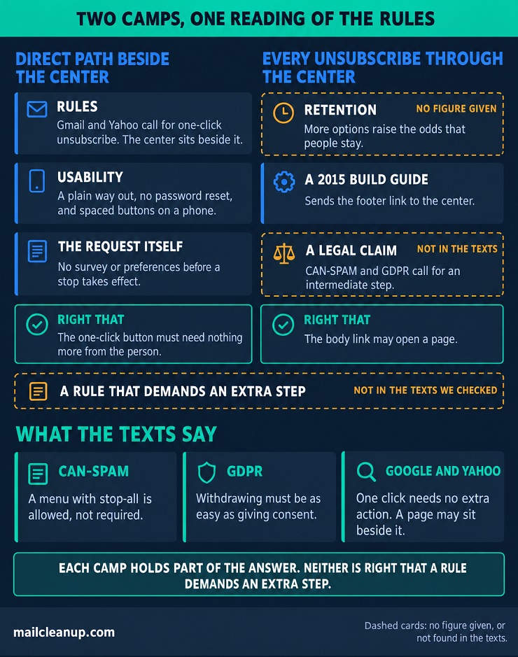
Published advice splits on one question: when someone clicks unsubscribe, where should they land? One camp ends the subscription at once and keeps the email preference center as a separate link. The other sends every unsubscribe through the center first. Of the six guides we read that take a clear position, three sit on each side, and none reconciles the two. In short, both are partly right. The Unsubscribe button inside Gmail or Yahoo must work in one click with no extra step. The link in your footer may open a page.
Keeping a Direct Unsubscribe Path Beside the Email Preference Center
In this camp, the unsubscribe link ends the subscription, and your email preference center sits beside it for people who want less, not none. Three guides argue for it, and each gives you something to borrow. One argues from rules. It says the 2024 Gmail and Yahoo requirements call for one-click unsubscribe, and that the center can sit beside it, not replace it. One argues from usability. Keep a plain way out, never ask for a password reset, and space the save and unsubscribe buttons on a phone. One argues from the request itself: nobody should finish a survey or choose preferences before a stop takes effect.
Their advice for your page comes to four points. Leave no gate before the stop, show stop-all inside the center, link clearly to both paths, and keep buttons apart on a phone. The cost is a missed moment. Someone who clicks unsubscribe never sees the center’s other options, so anyone who wanted less has to go looking. We would weigh that against a path that never stands between a person and the exit.
Routing Every Unsubscribe Through the Email Preference Center
In this camp, the unsubscribe link opens your email preference center before anything is processed, with a stop-all choice among the options. Three guides argue for it. One argues from retention: when ending everything is the only choice, people take it, so more options raise the odds they stay. It gives us no figure to check.
A 2015 build guide for one marketing platform sends the footer link to the center. The center can sit beside an unsubscribe page or replace it. A verification vendor’s guide goes furthest. It tells you unsubscribe should never come first, and that CAN-SPAM and GDPR call for an intermediate step. A second page from the same publisher says unsubscribe shouldn’t be a one-click button at all.
We checked that legal claim against the texts the guide names:
| What the guide cites | What the text says | Does it call for an intermediate step? |
|---|---|---|
| CAN-SPAM | The FTC requires a clear opt-out explanation, allows a menu with stop-all, and caps an opt-out at a reply or one page visit | No. A menu is allowed, not required |
| GDPR | The guide’s example is preselected boxes. Withdrawing must be as easy as giving consent, a one-step process per the UK regulator | No. It points to fewer steps |
So a single page that offers stop-all among other options fits both texts, and neither asks you to add a required extra step. That leaves retention as an argument, and none of the six guides links a study for it. If you route through the center, put stop-all on the first screen. Add no login, survey, or forced choice before the exit, and let people finish on that one page.
What Gmail, Yahoo, and CAN-SPAM Allow for an Email Preference Page
Read together, the rules let people unsubscribe through an email preference page, and for large senders they don’t let it replace the one-click unsubscribe. We checked primary texts from the FTC, Google, and Yahoo for what your email preference center may do. Only one of the six guides we read names the providers’ requirement.
| Source | What it says | What it means for an email preference page |
|---|---|---|
| FTC rule, 16 CFR § 316.5 | A sender can’t require a fee, details beyond the address plus opt-out preferences, or steps beyond a reply or one page visit | A page of choices can be the opt-out step if it is one page and asks only for the address and the choices |
| Senders past 5,000 daily messages to Gmail need one-click unsubscribe on marketing and subscribed mail, plus a clearly visible body link. One-click must need no extra action, and a subscriptions page is acceptable beside it, not as a substitute | The body link can open a page of choices. The one-click button can’t wait on one | |
| Yahoo | Bulk senders need one-click unsubscribe plus a clearly visible body link, which can lead to an email preference page | The body link may open an email preference page |
The law behind the first row, including how CAN-SPAM compares with other regimes, gets full coverage in the email compliance guide. Who counts as a bulk sender, and how each provider enforces these rules, is set out in bulk sender requirements from Google and Yahoo.
Each camp holds part of the answer. The direct camp is right that the one-click button must need nothing more from the person. The routing camp is right that the body link may open a page. Neither is right that a rule demands an extra step. Three things stay open for you. One is whether your body link goes to a page. Another is which list the one-click button covers. The last is what a confirmation page may ask.
A Setup That Keeps the Email Preference Center and the One-Click Header Together
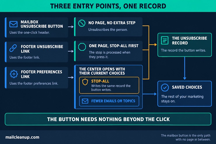
Give each entry point one job, and your email preference center and the mailbox’s Unsubscribe button stop competing. The button must need nothing beyond the click. The footer link can open a page for people who want less and people who want out. The one-click header is the hidden instruction in your email that makes that button work.
| Entry point | What it does |
|---|---|
| Mailbox Unsubscribe button | Unsubscribes the person, with no page or extra step in between |
| Footer unsubscribe link | Opens one page where the person confirms the stop, with stop-all first |
| Footer preferences link | Opens the center with the person’s current choices |
Four rules keep your paths consistent:
- If the mailbox button is used: unsubscribe the person, with no page in between.
- If the footer unsubscribe link is opened: show a page with stop-all first, and process the stop when they press it.
- If someone picks stop-all inside the center: write the same record the button writes, so the paths can’t disagree.
- If someone picks fewer emails or topics: save the choices and leave the rest of your marketing on.
One decision is yours: what the button covers. Google asks senders to give each subscription list its own identifier or From address. It also suggests letting people leave lists one at a time or all at once. If your streams are alike, we would let the button stop all marketing. If they differ, we would let it stop the stream the message belongs to. Put a button for fewer emails beside your confirm button, never in front of it. For how the header itself works, one-click unsubscribe walks through each provider’s rules.
Exit Surveys in an Email Preference Center
An email preference center can ask why people leave, but only after the unsubscribe is done and only as an optional question. The guides differ on timing. One says to ask only after the unsubscribe is processed and calls a forced survey hostile. One adds a brief survey for people who leave everything, without saying when. One warns against any survey first. We would follow the first.
| When the question appears | What the texts say | Verdict |
|---|---|---|
| Before the unsubscribe is processed, and required | The CAN-SPAM rule bars requiring details beyond the address plus opt-out preferences in order to honor an opt-out | Not allowed under the US rule |
| Before processing, but skippable | Nothing requires an answer, but the stop now sits behind a page of questions | Avoid it, because it works as a barrier |
| After processing, and optional | The rule limits what a sender can require, and an optional question after processing requires nothing | Allowed |
Four habits keep your survey short and fair:
- Confirm first: your page says the unsubscribe is done and when mail stops, before any question.
- One question, skippable: offer a brief list of reasons with an Other choice, and a visible way to skip.
- Ask for the reason only: no name, no phone number, nothing you can’t use.
- Keep it apart from the opt-out: store the answer separately, so a survey problem can never undo the unsubscribe.
It becomes a barrier when a field is required, when the survey comes before the confirm button, or when it needs a login. A pre-ticked stay-subscribed box does the same.
Compliance and Consent Records for an Email Preference Center
Four laws shape an email preference center, and each cares about a different part of it. They cover how fine the choices are, how easy leaving is, what proof you keep, and how fast you act. The rules differ by country, and we checked the texts in October 2026. We would build to the strictest rule you meet.
What GDPR, CAN-SPAM, CASL, and CCPA Mean for Email Preferences
Each law changes a different part of your email preference page. The table shows what each one asks of choices, of leaving, and of proof in an email preference center.
| Law | Choices | Leaving | Proof |
|---|---|---|---|
| GDPR (the UK regulator’s reading) | Its own opt-in for each purpose, unless bundling is clearly appropriate. A preference setting the person picks counts as an opt-in | No harder than consenting | Who, when, what they were told, how, and any withdrawal |
| CAN-SPAM (US) | A menu is allowed if it includes stopping all marketing | A reply or one page visit, and nothing more | Not addressed in the texts we read |
| CASL (Canada) | Leaving may cover all messages or a specified class | Without delay, within 10 business days, with no further action | The sender must prove consent |
| CCPA (California) | A notice at or before collection of what you gather and why | Opting out of selling or sharing data within 15 business days, no account needed | Not addressed in the Attorney General’s guide |
The detail behind each row, including the penalties, sits in email compliance. Two things follow for your center. Offer choices by purpose or topic, because the strictest reading wants separate opt-ins and CASL lets people leave one class of message. Keep leaving to one short step, because all four texts limit the effort.
Default States and Pre-Selected Boxes on the Email Preference Page
Show each person’s current choices in your email preference center, and where the law asks for consent, start new choices unticked. A few guides cover defaults, and they split: everything on, zero selections, the current state, or decide by regulation. None ties the choice to consent law, so the primary texts decide.
Under UK GDPR, silence, boxes that start ticked, and other default settings can’t count as consent. People must opt in actively. In Canada, the regulator’s example of valid written consent is a person checking a box. The time, date, purpose, and manner are stored. The FTC texts we read don’t address default boxes. Google also lists sign-up boxes that start checked among the practices to avoid. We would start every new choice unticked for everyone, because switching defaults by address adds work and the strictest rule is the safe one. A person who already saved choices sees those, not a default.
Recording Email Preferences: Source, Timestamp, and Category
Record every change to a person’s email preferences as an event you could show a regulator, not as a flag that gets overwritten. The UK regulator lists five things your email preference center should keep, and says the record must be as specific as the consent. Canada’s regulator gives a web example that stores the time and date, the purpose, and the manner. Keep six things, the five plus the choices themselves:
- Who: the address or an ID.
- When: a timestamp.
- What they saw: the wording and version of the page you showed.
- How: the form or page, and the data you received.
- Which choices: each topic or category, on or off.
- Withdrawals: that they left, and when you got the request.
A spreadsheet that says “consent provided” isn’t proof. Keep the data submitted and a timestamp tied to the version of the form in use. Keep a do-not-email list, often called a suppression list, after someone leaves, and tell people you keep it. CASL puts the burden of proving consent on the sender. A double opt-in adds a second timestamp, the confirmation click, and the double opt-in vs single opt-in guide weighs the trade-offs.
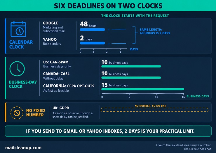
How Fast an Email Preference Center Must Honor a Change
Your email preference center should act on a change before the next send, and never treat the legal maximum as your target. Deadlines differ by source, and the shortest one that applies to you is the one to build to.
| Requirement | Deadline |
|---|---|
| Google (marketing and subscribed mail) | Within 48 hours |
| Yahoo (bulk senders) | Within 2 days |
| US: CAN-SPAM | Within 10 business days |
| Canada: CASL | Without delay, and within 10 business days |
| California: CCPA opt-outs | As fast as feasible, within 15 business days |
| UK: GDPR | As soon as possible, though a short delay can be justified |
If you send to Gmail or Yahoo inboxes, 2 days is your practical limit. Hours and business days are different clocks, and the clock starts with the request, not with your next list update. Check every queued send against the latest choices before it goes out. Then a change saved today can’t lose to a campaign scheduled last week.
How an Email Preference Center Works Behind the Page
A saved choice in your email preference center only counts if the system that sends your emails checks it before every send. The email preference page is just a form. The choice lives in a record of each person’s email preferences, and every tool that sends mail has to read that record. A tool working from a list exported last week can email someone who left yesterday.
Five plain questions show whether your platform or developer has built this properly:
- Send-time check: before each send, does the system check every person’s latest choices, including emails already scheduled?
- One record: do the newsletter, the automations, and the website all read the same record?
- Renamed topics: if you rename or retire a topic, what happens to the people who chose it?
- Old links: do links in old emails still work, and is each link made for one person?
- Imports: can a file import ever re-subscribe someone who opted out?
One guide we read suggests a simple test for imports. Replay an old import after someone opts out, and check that they stay opted out. The full build is a project of its own. It runs from the record’s fields to the pre-launch tests, and building an email preference center from step by step.
Keeping Addresses Clean Inside an Email Preference Center
Your email preference center only works if the addresses behind it are real and belong to the people who manage email preferences through it. Three things break that. One is a mistyped or throwaway address typed into your page. Another is a change of address nobody confirmed. The last is a list that was never checked before your center’s link went out.
Why the Address Field Is the Weak Point of an Email Preference Page
The address field is the one place on your email preference page where a visitor can type anything. A typo sends your later emails to a stranger or to nowhere. Some guides include a field for updating the address, and only one says to check it.
If you check addresses as people type them, that is called real-time verification. The post on real-time email verification sets out how it works and where it fits.
| Entry | What goes wrong | What to do |
|---|---|---|
| A typo | Mail bounces, or reaches a stranger | Check the address as it is typed, and ask the person to re-read it |
| A throwaway address | The person never sees your mail | Treat it as a risk to weigh, not an automatic block |
| An accept-all domain | A mistyped name can still look valid | Confirm the address, because a check alone can’t settle it |
| Someone else’s address | A stranger gets mail they never asked for | Send only a confirmation until the owner confirms |
Keep your checks from over-correcting. Security guidance for web forms says to accept odd but valid addresses and turn away only clearly broken ones. For throwaway addresses, those temporary mailboxes built to be dropped, it prefers weighing the risk to blocking them all. Spotting one is the job of the disposable email address guide.
In an email preference center, role-based addresses such as info@ or support@ need a different kind of care. One inbox can serve a whole team. So one colleague’s unsubscribe can stop everything you send to it, and another’s topic change undoes the first. Keeping them is a judgment call. It turns on how the address signed up and what you send, and role-based email addresses walks through that decision.
Confirming a New Address Entered Through Email Preferences
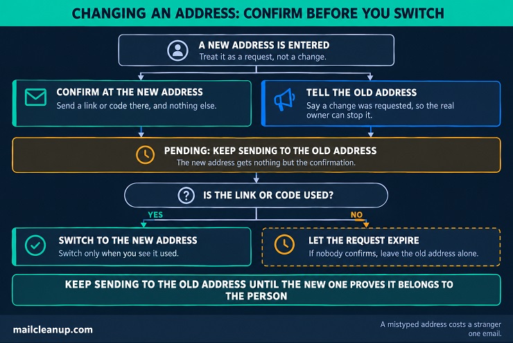
Treat a new address entered through your email preferences as a request, not a change. We would keep sending to the old address until the new one proves it belongs to the person. Three steps keep the change safe:
- Confirm at the new address: send a link or code there, and switch only when you see it used.
- Tell the old address: say a change was requested, so the real owner can stop it.
- Let unconfirmed requests expire: if nobody confirms, leave the old address alone.
Until the new address confirms, we would send it nothing but the confirmation, so a mistyped address costs a stranger one email. Security guidance for accounts says the same from another angle. Changing an address is changing identity, so it says to notify the current address and require confirmation at the new one. If your email preference center has no login, it can’t ask the person to sign in again. That is why those two steps carry the weight. It is the same proof a double opt-in asks for at sign-up. Choosing between that and a single opt-in is the subject of double opt-in vs single opt-in.
Verifying the List That Feeds an Email Preference Center
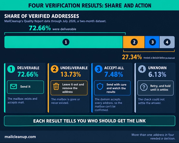
An email preference center can’t fix a list that was never checked. Before you send everyone the link, run your whole list through bulk verification, and repeat it on a schedule. The checks behind it are laid out in what is email verification. Verification returns four results, and each one tells you who should get the link:
| Result | What it means | The link |
|---|---|---|
| Deliverable | The mailbox exists and accepts mail | Send it |
| Undeliverable | The mailbox is gone or never existed | Leave it out and remove the address |
| Accept-all | The domain accepts every address, so the mailbox can’t be confirmed | Send with care and watch the results |
| Unknown | The check could not settle the answer | Retry, and hold the address until it does |
In MailCleanup’s Quality Report data, a two-month dataset, 72.66% of verified addresses were deliverable. The other 27.34% needed a decision before you should send to them: 13.73% were undeliverable, 7.48% accept-all, and 6.13% unknown. To see why an accept-all result is so hard to read, start with catch-all email addresses.
Lists also age. One MailCleanup client’s list was tracked from September 2025 to August 2026. By the end, 23.79% of the addresses that began deliverable no longer were. Old, unchecked lists are also where spam traps hide, and spam traps covers how they get onto a list.
Measuring an Email Preference Center
An email preference center earns its keep only if you can see what it changes. Measure a few things, on the same list, over matched weeks, and read them with care.
Metrics That Show Whether Email Preferences Are Working
Only some guides name metrics, and those that do are thin on how to read them. Email preference center best practices for measurement start with a short list tied to the promises your page makes. These eight cover most of them:
| Metric | What it tells you | How to read it |
|---|---|---|
| Unsubscribe rate | Whether people still leave in full | Watch the rate per send, so list growth doesn’t distort it |
| Opt-down to opt-out ratio | How many leavers chose less instead | Compare people who changed a setting with people who left |
| Complaint rate | Whether people still hit the spam button to get out | Gmail’s limits are tenths of one percent, so small moves matter |
| Page completion | Whether visitors finish a change | A low rate points to the layout or the save step |
| Suppression accuracy | Whether opted-out people get nothing afterwards | The target is zero sends after an opt-out |
| Segment engagement | Whether topic groups respond better | Use clicks and replies, not opens, which Apple Mail Privacy Protection can inflate |
| Profile completeness | Whether fields are being filled | Drop fields nobody answers |
| Return after a pause | Whether paused people come back | Check who is active after the restart date |
Start with the three that match your biggest promise.
Reading Email Preference Center Results Without Fooling Yourself
A before-and-after number is easy to get and easy to misread. Five things can distort the number you get:
| Distortion | What it does | What to do |
|---|---|---|
| Unmatched windows | A launch week against a quiet week can look like a win or a loss | Compare equal periods with the same weekdays |
| List-mix shifts | New and long-standing subscribers behave differently | Split new from established subscribers |
| Seasonality | Holidays and sale seasons can move every rate | Compare with the same weeks last year |
| A changing list | An average across different lists can’t show change | Track one list, or one sign-up cohort, for the whole window |
| Self-selection | People who use the page may already like your emails | Compare page users with similar subscribers who didn’t use it |
A before-and-after can’t prove your email preference center caused the change, because something else usually changed too. If you can, run a test with a comparison group, which is stronger evidence. For example, leave the preferences link out for a small random group while every group keeps the unsubscribe link. MailCleanup’s own decay figure comes from one client’s list, the same addresses re-verified monthly, because a mix of lists cannot show change over time.
Review rhythm: we would check the rates monthly and the list-level checks quarterly. Recheck everything after any change to the page, on the same list and the same weeks.
Your Next Step: Audit Your Email Preference Center
So what is an email preference center worth if it only looks right? The page matters less than what happens after someone saves a choice. An audit takes three checks, and you can finish them in an afternoon. First, test the unsubscribe path the way a subscriber would, on a phone. Press the mailbox’s Unsubscribe button, open your footer unsubscribe link, and open the preferences link. Each one should do its one job, with no login or survey in the way.
Second, test enforcement. Change one setting, then check whether your next send honors it, including any email already scheduled. Replay an old import for someone who opted out, and confirm they stay opted out. Whatever email preference center examples you admire, this is the part a screenshot can’t show, because it happens out of sight.
Third, check the list behind the page. A center can’t fix addresses that don’t work, so run your whole list through verification before you send everyone the link. MailCleanup’s bulk email verification takes an uploaded file of addresses and returns each one as deliverable, undeliverable, accept-all, or unknown. Fix what the audit finds, then measure again on the same list and the same weeks.
FAQs on the Email Preference Center
What is the difference between an email preference center and an unsubscribe page?
An unsubscribe page does one job: it ends the subscription. An email preference center lets the same person choose fewer emails or only certain topics, and it still keeps a way to leave. You will usually run both, with the unsubscribe link beside a link to the center.
Are email preference centers legally required?
No law we checked requires an email preference center by name, but each requires an easy way out for your subscribers. US law caps an opt-out at a reply or one page visit and expects it honored within 10 business days. Canada sets the same 10 business days. UK and EU rules say withdrawing consent must be as easy as giving it.
What should an email preference center include?
Two controls belong on every email preference center: a clear way to stop all marketing email, and a way to correct the email address. Add topics and frequency next, then channels and profile fields only when you have a use for them. Say which messages always continue, such as receipts and security alerts.
Will an email preference center stop all unsubscribes?
No. An email preference center gives people who want less a way to stay, but some will leave anyway. Most published success rates have no named source. One pause test went the other way, with the unsubscribe rate rising from 0.99% to 2.3% across 2,802 people. Test any option on your own list.
How often should you remind subscribers about their email preferences?
Send on a trigger, not a calendar: when you launch the email preference center, add a topic, or change your purposes. Where consent is your basis, the UK regulator suggests refreshing it every two years if you are in doubt. It also suggests occasional reminders if you aren’t in regular contact. Leave out anyone who has already updated their email preferences.
Do you still need an email preference center if you have one-click unsubscribe?
You don’t need one to meet the rules, but you do need one to offer anything short of leaving. One-click unsubscribe only ends the subscription, and Gmail requires it from senders past 5,000 daily messages. An email preference center adds choices such as fewer emails or only some topics. Google says your subscriptions page may sit beside one-click but not replace it.
How does an email preference center affect deliverability?
It helps indirectly. Google says easy unsubscribing helps keep spam rates low. People who can’t find a way to manage email preferences may press the spam button instead. A center doesn’t fix your dead addresses or missing authentication. Gmail also requires senders who pass 5,000 daily messages to offer one-click unsubscribe on marketing email.
Which metrics show whether an email preference center is working?
Track the unsubscribe rate, the ratio of opt-downs to opt-outs, the complaint rate, and how many visitors finish a change. Check that people who opt out of your email preference center receive nothing afterwards. Read each one on matched weeks and the same list, because a rise in clicks may only show that engaged people use the page.