
Most guidance on email list decay treats it as a steady drip. Clean your list every quarter, lose roughly the same slice of addresses, repeat. We tracked one client’s list ourselves, verified every month for a full year, and found something different. The rate itself sped up, and you’ll see exactly how much in the numbers below.
In the first three months after the first cleaning process, the list lost 4.24% of its deliverable addresses. In the last three months of tracking, June to August, it lost 11.91% of the addresses still deliverable, close to three times as fast. A list you haven’t cleaned in six months isn’t just accumulating the same steady damage for twice as long. It’s decaying at a meaningfully faster rate than it was when the last cleaning happened.
That distinction matters for anyone setting a re-verification schedule, including you. Most published guidance on email list decay cites a flat 20-30% annual estimate. A quarterly cadence built around that number undercounts what a genuinely neglected list is actually losing. This report comes from a rolling 12-month dataset we tracked directly: one client’s roughly 1,000,000-address list, re-verified monthly. That’s a real tracked list, not a modeled industry average. The full monthly curve, the reasons behind the decay, and a tier-based way to place your own list against these findings follow below.
TL;DR on Email List Decay
- MailCleanup tracked one client’s ~1,000,000-address email list monthly for 12 months and measured a 23.79% email list decay rate, inside the published 20-30% range.
- The decay rate accelerated through the year: the first three months after the first cleaning process lost 4.24% of the tracked addresses and the last three months of tracking lost 11.91% of what was still deliverable, close to three times as fast.
- Of the 217,061 addresses that decayed, 80.84% came from deleted mailboxes, disabled mailboxes, or expired domains; the remaining 19.16% were reclassified as Accept-All or Unknown.
- MailCleanup’s Email List Decay Index sorts any list into four tiers, Fresh, Aging, At Risk, or Critical, based on months since its last cleaning.
- Lists re-verified every one to two months never reach the tiers where email list decay creates real bounce-rate risk.
- This report tracks one real, consistently verified list rather than a cross-client industry average or a theoretical rate.
What Is Email List Decay?
Email list decay is the process by which addresses in your list that were once deliverable stop being deliverable, without any action from the sender. A person changes jobs and their old work inbox gets deactivated. A domain expires because a small business shuts down. A mailbox that used to accept mail starts bouncing every message it receives. None of this happens because you did anything wrong as the list owner. It happens because the world behind the list keeps changing.
That’s a different failure mode than an unsubscribe or a spam complaint, both of which are choices a recipient makes. Decay is closer to email list churn in spirit: addresses quietly aging out of usefulness. But the two terms get used loosely and interchangeably. That blurs a real distinction worth keeping straight, covered in more depth below. For this report, decay specifically means an address in your list that was verified Deliverable and later verified as something else: Undeliverable, Accept-All, or Unknown.
How We Measured the Email List Decay Rate: One List, Verified Monthly for 12 Months
Here’s exactly how we measured email list decay for this report.
The Client Behind This Email List Decay Report
This report comes from one anonymized MailCleanup client, who gave direct permission for their verification data to be used this way. It draws on the same email verification process MailCleanup runs for every client.
The client’s list started at roughly 1,000,000 email addresses in September 2025. Unlike most clients, who send a new or different list for each cleaning, this client re-verifies close to the same list on an ongoing basis. It’s the same practice we’d recommend for your own list too. That consistency is what makes a decay measurement possible at all. Without it, there’s no single population to track from one month to the next, only a series of unrelated snapshots. Those snapshots couldn’t support a genuine email list decay measurement.
The window covered here runs from September 2025 through August 2026, a rolling 12 months rather than a year-over-year comparison. A true year-over-year figure needs a full second year of the same list to compare against, which won’t exist until December 2026. We’ll rebuild this report once that data exists.
Why One Tracked List Beats Client Averages for Measuring Email List Decay
Most published figures on email list decay come from one of two places. Some are cross-client averages: a verification company adds up results across millions of customers and different lists. It then reports the aggregate figure for a given year. Others are theoretical: take a commonly cited monthly rate and apply it forward across a hypothetical list that was never actually tracked. That hypothetical list might look a lot like yours.
Both approaches have a real limitation you should know about before trusting either one. A cross-client average mixes together lists in every condition: freshly built, badly neglected, actively maintained. The resulting number describes the industry, not any single list’s actual trajectory, including whichever one you’re trying to plan around. A theoretical projection never touches real data at all; it just multiplies a rate that came from somewhere else.
This report does neither. It follows one real client’s list: the same roughly 912,317 addresses that verified as Deliverable at the start. We checked those addresses again every month for a full year. Every figure below comes from that one tracked population, not an average and not a projection.
What Counts as Email List Decay
Not every address in the client’s original list counts as email list decay in this report. Of the roughly 1,000,000 addresses submitted for the first cleaning, 912,317 verified as Deliverable. The remaining 87,683 verified as Undeliverable, Accept-All, or Unknown from the very first check, before any monthly tracking began. If you’re checking your own list against this report, that distinction matters.
Those 87,683 addresses matter to the client’s overall list health, but they don’t belong in a decay measurement. Decay specifically means an address that was good and became bad. An address that was never good in the first place has nothing to decay from. Including it would overstate the finding by counting a pre-existing problem as if it happened during the tracked year.
| Counts toward decay | Doesn’t count toward decay | |
|---|---|---|
| Status at first cleaning | Deliverable | Undeliverable, Accept-All, or Unknown |
| Addresses | 912,317 | 87,683 |
| Tracked monthly through August 2026 | Yes | No |
Every figure in this report, the 23.79% headline rate, the monthly curve, the reasons breakdown, is measured against the 912,317 that started Deliverable. That’s the tracked cohort, and it’s the only population these findings describe.
The MailCleanup Email List Decay Report: 23.79% Decayed Against a Published 20-30% Range
Our own tracked cohort decayed at 23.79% over the 12 months covered in this email list decay report. That number needs context to mean anything: is it high, low, or roughly what everyone else already reports?
Search for published figures on email list decay and you’ll find the numbers cluster in a fairly narrow band. They don’t come from a single, consistent source, though. A few different reasons explain why the specific figures vary from one publisher to the next:
- The measurement window differs: Six months of decay reads as roughly half of twelve months of decay, and articles don’t always tell you which one they’re citing.
- The definition differs: Some figures count only addresses that stopped being deliverable. Others fold in disengaged-but-technically-valid addresses too, which inflates the number.
- The population differs: A B2B-only figure runs higher than a mixed B2B/B2C average, since job-change-driven decay hits business addresses harder.
Once those three variables are held constant, the published range narrows considerably. Here’s how our tracked figure compares against the most commonly cited published numbers, each with its actual basis stated rather than just the headline percentage.
| Source | Reported Rate | Basis |
|---|---|---|
| This report (MailCleanup) | 23.79% | One client, 912,317 addresses, tracked monthly for 12 months |
| Canonical B2B benchmark | ~22.5% (2.1% monthly) | Widely cited estimate; original underlying methodology isn’t publicly detailed |
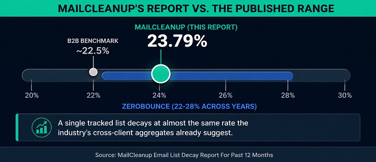
| ZeroBounce Email List Decay Report | 23% (2025); 22-28% across 2021-2025 | Cross-client aggregate, 11B+ addresses processed in 2025 |
Our 23.79% lands inside the already-published range, not outside it. That’s a genuine finding worth stating plainly: a single, real, consistently tracked list decays at almost exactly the rate the industry’s cross-client aggregates suggest. The decades-old B2B benchmark lands in the same range too. The methodology differs completely, one real cohort against millions of mixed lists, yet the two approaches converge on a similar number. You can treat that convergence as real evidence the underlying phenomenon is genuine and stable. It’s not an artifact of how either side chose to measure it.
The Monthly Email List Decay Rate, Charted: September 2025 Through August 2026
The 23.79% figure is a single number for the full year of email list decay. It hides real movement underneath it. Here’s the same cohort we tracked, the 912,317 addresses that started Deliverable, checked month by month from the first cleaning through the last.
| Month | Deliverable | Monthly Decay | Cumulative Decay |
|---|---|---|---|
| Sept 2025 | 912,317 | n/a (baseline) | 0.00% |
| Oct 2025 | 899,248 | 13,069 | 1.43% |
| Nov 2025 | 886,890 | 12,358 | 2.79% |
| Dec 2025 | 873,640 | 13,250 | 4.24% |
| Jan 2026 | 858,914 | 14,726 | 5.85% |
| Feb 2026 | 843,789 | 15,125 | 7.51% |
| Mar 2026 | 827,459 | 16,330 | 9.30% |
| Apr 2026 | 809,914 | 17,545 | 11.22% |
| May 2026 | 789,248 | 20,666 | 13.49% |
| Jun 2026 | 760,259 | 28,989 | 16.67% |
| Jul 2026 | 729,914 | 30,345 | 19.99% |
| Aug 2026 | 695,256 | 34,658 | 23.79% |
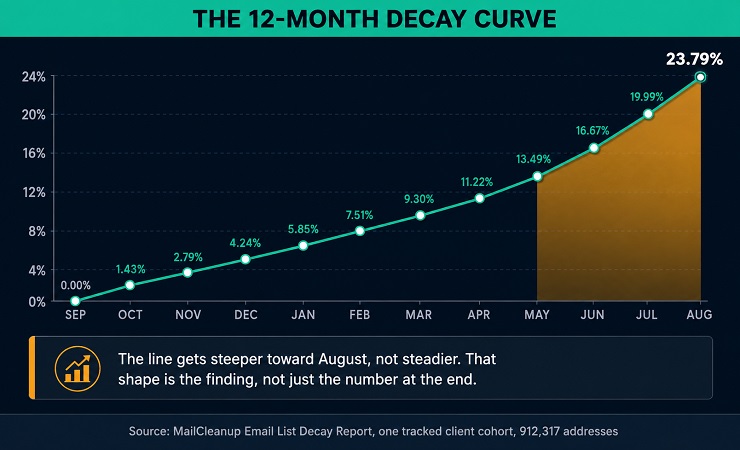
Two things stand out from that progression, and both matter for your own list. First, the monthly loss never reverses. Every single month shows a positive decay figure, never a recovery. That matches exactly what the methodology in the section above predicts. Addresses move in one direction, from Deliverable into something else, and you never see them come back.
Second, the monthly figure itself grows, not just accumulates. January lost 14,726 addresses; by May, that monthly figure had grown to 20,666; by August, it reached 34,658, more than double January’s total. A flat 20-30% annual estimate implicitly assumes something close to a steady monthly loss. This cohort didn’t behave that way. The next section works out why.
The Email List Decay Index: Where Does Your List Stand?
Every list in this report’s tracked cohort passed through the same four stages, distinguished only by how long it had gone since its last cleaning. You’ll likely recognize the pattern. The Email List Decay Index turns that progression into four tiers, built directly from the monthly figures above rather than from a generic industry estimate. Find the tier that matches your own list’s last cleaning date, and the real numbers behind it follow.
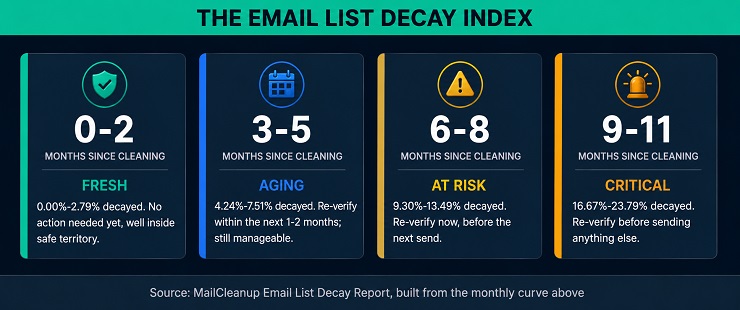
| Tier | Months Since Cleaning | Decay Range |
|---|---|---|
| Fresh | 0-2 | 0.00%-2.79% |
| Aging | 3-5 | 4.24%-7.51% |
| At Risk | 6-8 | 9.30%-13.49% |
| Critical | 9-11 | 16.67%-23.79% |
Each tier gets its own real numbers below, not just the range.
Fresh (0-2 Months): Minimal Email List Decay Rate
A list that’s 0 to 2 months past its last cleaning sits close to where it started. Deliverability sat at 0.00% decayed the moment the cleaning finished, climbing to just 1.43% a month later and 2.79% by the second month out. If your list is in this window, bounce rates from decay alone should stay well under any provider’s warning threshold.
That doesn’t mean email list decay hasn’t started. It has, from the very first day. The monthly figures never show a flat line, even this early. Your list in this tier is in the best position it will ever be in, not a list that’s somehow paused.
Aging (3-5 Months): Email List Decay Beginning to Compound
By month three, decay has moved past the rounding-error stage. The tracked cohort’s deliverable share had dropped to 4.24% decayed by December, three months out from the September cleaning. By four months it reached 5.85%, and by five months, 7.51%.
That’s the range where email list decay starts compounding into a real, visible trend rather than background noise. If your list is in this window, it hasn’t crossed into dangerous territory yet. But the gap between this tier and Fresh is already more than double. Waiting longer only widens it.
At Risk (6-8 Months): Email List Decay Accelerating
Six to eight months past cleaning, the email list decay numbers shift from a trend to a genuine warning sign for your list. The cohort reached 9.30% decayed at six months, 11.22% at seven, and 13.49% by eight. That’s more than a full percentage point of new decay most months in this window.
A list six months overdue is already decaying noticeably faster than it was in its first six months. That’s not a coincidence; the next section works out exactly why the rate itself climbs. For now, the practical read is simpler: by month eight the cohort had lost 13.49%, more than half of the full-year 23.79%, with three months still to run.
Critical (9-11 Months): Severe Email List Decay Rate
Nine to eleven months past cleaning is where the tracked cohort’s email list decay stopped looking manageable. The rate reached 16.67% at nine months, 19.99% at ten, and 23.79% by eleven, the full-year headline figure this report leads with.
Close to a quarter of the addresses that started Deliverable are gone by this point. If you’re sending into a list this far past its last cleaning, you’re taking on real risk. Decay alone can push the bounce rate well past most providers’ 2% warning threshold. That’s before accounting for anything else that might already be wrong with the list. This is the tier the intro’s warning was actually describing: not just more decay, but decay running at its fastest pace of the whole year.
Why Email List Decay Accelerates: The Quarterly Breakdown
The quarterly view makes the email list decay acceleration impossible to miss. Break the same 912,317-address cohort into four blocks, counted from the first cleaning month – September (the first holds two monthly re-checks, the others three), and you can watch the pace of decay rise in every block, with the last losing nearly twice the share of the one before it.
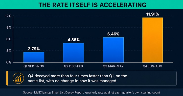
| Quarter | Quarterly Decay Rate | Cumulative Decay |
|---|---|---|
| Q1 (Sept-Nov) | 2.79% | 2.79% |
| Q2 (Dec-Feb) | 4.86% | 7.51% |
| Q3 (Mar-May) | 6.46% | 13.49% |
| Q4 (Jun-Aug) | 11.91% | 23.79% |
That quarterly rate isn’t computed against the original 912,317 baseline each time. It’s computed against each quarter’s own starting count, which shrinks a little as addresses decay out. You might reasonably wonder: is the acceleration real, or just an artifact of measuring against a smaller number each time?
The arithmetic rules that out. Q4’s starting pool, 789,248, is only about 13.5% smaller than Q1’s starting pool of 912,317. A denominator shrinking by 13.5% lifts a rate by about 16% at most, so it can’t turn the 4.24% lost in the first three months after the cleaning into 11.91% on its own. Don’t let anyone tell you the acceleration is just a measurement artifact. The rate nearly tripled, against the roughly 16% a shrinking base could add.
The absolute number of addresses lost each quarter is climbing too, from 38,677 in the first three months after the cleaning to 93,992 in the last three. Something in the underlying process is genuinely speeding up, not just the math you’d use to explain it away.
The likely mechanism: decay is a process, not a single event, and unmanaged lists accumulate addresses mid-process. An address rarely fails outright with no warning. A person changes jobs and their old inbox gets forwarded for a while before it’s finally closed. A domain quietly stops renewing months before it fully expires. If you’re not watching for it, engagement typically fades before an address hard-fails, not the other way around.
On a list that’s actively re-verified, addresses showing early warning signs get caught and removed before they convert into a full decay event. That’s exactly what you want. On a list left alone for months, that doesn’t happen, and you don’t get any warning before it does. The population of addresses already partway through the failure process keeps growing every month the list goes unmanaged. That’s on top of whatever newly enters that process each month too. By months nine through eleven, that accumulated backlog is converting into actual failures faster than it did in months one through three. Early on, the list was closer to its last real cleaning, with fewer addresses mid-process to begin with.
This dataset can’t isolate individual addresses to prove that mechanism address by address; it’s one client’s aggregate monthly counts, not address-level engagement logs. But it’s the standard explanation for accelerating decay in the wider research, and it’s worth keeping in mind for your own list too. And it fits the shape of what shows up here: a rate that starts low and climbs, not one that stays flat.
Email List Decay Causes: The Five Reasons Behind 217,061 Decayed Addresses
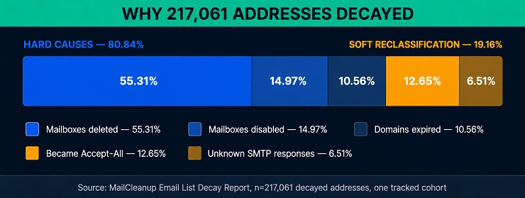
The 217,061 addresses behind this report’s email list decay figure didn’t all fail the same way. MailCleanup’s verification process sorts each decayed address into one of five specific reasons. That gives a genuine breakdown of what actually happened, not a single undifferentiated bounce count. Before breaking down exactly how those five reasons split out, it’s worth looking at the broader email list decay causes this report’s categories map onto. Some of them may already be happening in your own list.
Common Email List Decay Causes Across the Industry
MailCleanup’s own report measures what happened to one tracked cohort. The broader email list decay causes behind those numbers show up across virtually every list, including yours:
- Job and role changes: The single most common driver, especially for B2B lists. A corporate email address gets deactivated the moment someone leaves a company. Nothing you do on the sending side can prevent email list decay triggered this way. The cause sits entirely outside your control as the list owner.
- Company closures, mergers, and rebrands: When a business shuts down or changes its domain entirely, every address you have at that domain stops working at once, not gradually.
- Abandoned personal inboxes: People switch primary email providers and simply stop checking the old address. It technically still exists and hasn’t been formally closed, so you won’t find it flagged anywhere else.
- Fake or disposable signups: Some addresses were never meant to last past a single signup. This is the one cause list owners can act on directly. A double opt-in step can prevent email list decay from disposable addresses before they ever join your list.
- Full or unmonitored mailboxes: An inbox that fills up and never gets cleared behaves the same as a dead address for delivery purposes on your end. It doesn’t matter whether anyone’s actually still reading it.
None of this changes this report’s own 23.79% email list decay rate. It explains why the number looks the way it does: mostly forces outside anyone’s direct control, with one exception you can act on yourself.
| Reason | Count | % of Decayed |
|---|---|---|
| Mailboxes deleted | 120,056 | 55.31% |
| Domains expired | 22,912 | 10.56% |
| Mailboxes disabled | 32,501 | 14.97% |
| Became Accept-All | 27,467 | 12.65% |
| Unknown SMTP responses | 14,125 | 6.51% |
The Hard Causes of Email List Decay: Deleted, Disabled, and Expired (80.84%)
Three reasons make up 80.84% of all email list decay in this cohort. They share something in common: once they happen, the address is genuinely gone, not just something you’ll get back later.
Mailboxes deleted account for 55.31% of decay on their own, more than half. This is the classic job-change or account-closure scenario: someone leaves, and IT or the mail provider deactivates the inbox. It’s the same mechanism covered in why do emails bounce. Every message you send to it afterward bounces permanently. Mailboxes disabled add another 14.97%, a related but distinct status, the mailbox still technically exists but has been switched off rather than removed outright. Domains expired make up the remaining 10.56%: the business behind the address stopped renewing its domain, and every address at that domain died at once.
None of these three reverse. Once a mailbox is deleted or a domain lapses, there’s no scenario where that specific address in your list becomes deliverable again.
Soft Reclassification and Email List Decay: Accept-All and Unknown (19.16%)
The remaining 19.16% of email list decay looks different. These addresses didn’t necessarily stop existing; their risk classification changed, often without anything you’d notice at your end.
Became Accept-All accounts for 12.65%. A domain that used to reject invalid addresses individually started accepting all mail regardless of whether the specific mailbox exists. That’s usually a mail server configuration change on the receiving end, not something about the individual address. Unknown SMTP responses make up the final 6.51%. These are cases where the receiving server didn’t give you a clear accept-or-reject signal during verification, an ambiguous result rather than a confirmed failure.
Both categories carry real risk even though neither is a confirmed hard failure. Don’t assume your list is safe just because the bounce count looks clean. An Accept-All domain will silently swallow email you send to a dead mailbox behind it, producing no bounce and no warning. Left unmanaged long enough, addresses like these are also how spam traps end up back on a list that looked clean. An Unknown result means the address’s true status is genuinely uncertain, not clean.
What Email List Decay Costs You at Each Index Tier
Email list decay doesn’t just show up as a percentage; every send to a decayed address costs something even when it doesn’t bounce loudly. Credits or sending capacity go toward an address that was never going to convert. But the bigger cost isn’t the wasted send itself; it’s what a rising bounce rate does to every send that follows it.
Two mechanisms do the damage. Throttling means a provider slows how fast it accepts your mail. Even your best-performing sends take longer to land, sometimes trickling in over hours instead of arriving at once. Filtering means a growing share of what does get through lands in the spam folder instead of the inbox. That’s not just for the campaign that triggered it, but for sends afterward too, until your reputation recovers. Most providers treat a sustained bounce rate above 2% as the line where this starts.
A Fresh list, 0 to 2 months since cleaning, carries almost none of this risk; decay alone keeps it well under the 2% line. An Aging list is where the wasted-send cost starts to matter even though the bounce-rate risk is still low. Every address that’s already decayed but not yet re-verified is still getting sent to, for nothing.
A Critical list can push a send’s bounce rate past 2% from decay alone, before anything else goes wrong. By At Risk, 6 to 8 months out, decay alone is already approaching double digits. Those addresses are still sitting in your active list, still getting sent to. Past 9 months, that risk becomes real. Throttling and filtering stop being theoretical and start being what actually happens to the next campaign, and the one after it. That drags overall email deliverability down along the way.
None of this puts an exact dollar figure on a bounce. Our guide to the real cost of email bounces does that in full. It walks through wasted spend, and the compounding reputation tax bounce rate puts on every send afterward. The mechanism above is what drives that cost up as a list moves through these tiers; the dollar figures behind it also live in that guide.
How Often to Re-Verify and Prevent Email List Decay, By Index Tier
The Index above describes where a list stands. What to actually do about it depends on the same four tiers.
| Tier | Recommended Cadence | Why |
|---|---|---|
| Fresh | No action needed yet | Decay under 3%, well inside safe territory |
| Aging | Re-verify within the next 1-2 months | Decay compounding, still manageable |
| At Risk | Re-verify now, before the next send | Decay in double digits, bounce risk rising |
| Critical | Re-verify before sending anything else | Close to a quarter of the cohort gone |
None of this fully stops email list decay from happening. Domains still expire and mailboxes still get deleted no matter how often you check a list. What re-verification actually does is catch those addresses immediately instead of letting them sit in an active sending list for months. A list re-verified every one to two months never reaches the At Risk or Critical tiers at all. It gets caught and corrected while still Fresh or Aging.
That’s the real case for a tighter cadence: you can’t prevent email list decay address by address. But you can prevent it from accumulating into Critical-tier bounce-rate exposure. Re-verification is one piece of the broader ongoing hygiene discipline a list needs, not a replacement for it.
Find Your List’s Position on the Email List Decay Index
Every number in this email list decay report traces back to one real list, tracked monthly for a full year. 23.79% decayed, with the rate itself accelerating from 4.24% in the first three months after the first cleaning process to 11.91% in the last three. 217,061 addresses were gone, for five distinct, documented reasons.
The question worth asking isn’t whether your own list is decaying. It is, from the day it was last cleaned. The question is which tier it’s actually in: Fresh, Aging, At Risk, or Critical, and whether that position matches how it’s being treated. A list that hasn’t been re-verified in eight or nine months isn’t behaving like the email churn rate or the unsubscribe numbers might suggest. Those numbers don’t capture decay at all, only voluntary departures. Deliverability decay runs separately, and silently, underneath them.
Run a fresh verification pass and find out exactly where your list stands against the Index above, rather than guessing from how long it’s been.
FAQs on Email List Decay
What’s the difference between email list decay and email list churn?
Churn usually means people actively leaving a list: unsubscribes, opt-outs, subscribers who ask to be removed. Email churn rate typically measures that voluntary departure. Decay is different. It’s addresses in your list going bad involuntarily, without the subscriber doing anything: a job change, a closed account, an expired domain. This report measures decay specifically, not email list churn.
How often should you re-verify an email list?
This report’s own data points to a clear answer: before the Aging tier turns into At Risk, so within about five months at the latest. Multiple independent sources converge on a similar range, generally every one to six months depending on your list size and how fast it grows. A list that’s actively re-verified never reaches the Critical tier this report describes.
Can email list decay be prevented?
No, not entirely. Domains and mailboxes will keep expiring and closing regardless of how you manage a list; that part of decay can’t be stopped. What re-verification prevents is decay accumulating unnoticed. Catching addresses within a month or two of going bad protects your deliverability far better. Letting them sit in an active list for most of a year does not.
What causes email list decay?
Mostly job changes and account closures. In this report’s own data, mailboxes being deleted accounted for 55.31% of all decay on its own, the single largest cause by a wide margin. Domain expirations and disabled mailboxes make up most of the rest. A smaller share comes from addresses reclassified as Accept-All or Unknown rather than confirmed dead. Don’t assume every risky address on your list is actually gone.
Does email list decay happen faster for some lists than others?
Yes, list type matters. B2B lists tend to decay faster than B2C lists because business addresses are tied directly to employment, and people change jobs on an ongoing basis. This report is based on one client’s list, so it doesn’t tell you exactly how your own list type compares. It only establishes what happened to this specific tracked cohort.
What bounce rate should you worry about because of decay?
Most providers treat a sustained bounce rate above 2% as a warning sign, and higher than that risks throttling you. In this report’s cohort, a list past the At Risk tier is already decaying fast enough to matter. Six or more months since cleaning, it can push your bounce rate past that line on decay alone. That’s before counting anything else already wrong with the list.
How is this report’s 23.79% decay rate actually calculated?
It’s the share of the tracked cohort, 912,317 addresses that verified as Deliverable in September 2025. That’s the portion that had moved to Undeliverable, Accept-All, or Unknown by August 2026. If you want to run the same math on your own list, that’s 217,061 addresses divided by 912,317, the cohort’s original size. Addresses that were never Deliverable in the first place aren’t part of that calculation at all.
What should you do if your list is already in the Critical tier?
Re-verify before sending anything else. A Critical-tier list, more than nine months since its last cleaning, has already lost close to a quarter of its originally Deliverable addresses. Sending into it risks a bounce rate that damages your sender reputation for weeks or months, well beyond that single campaign. A full re-verification pass resets the list to Fresh and stops the accumulated decay from doing more damage.