
MailCleanup has verified 3,596,809 real email addresses over the past 12 months. We’re publishing the full breakdown here, not behind a download form. That distinction is worth pausing on. We checked the two other genuine email verification statistics reports online, from SafetyMails and Bouncer. Both require your email address before you see a single number. One of them isn’t built from real verification results at all. It’s a survey of what marketers believe about their lists, not what happens when those lists actually get checked.
This report is different on both counts. Every figure below comes from real verification runs, and every figure is right here in the post you’re reading.
Across the full year, 2.43% of verified addresses came back as Unknown. In a more recent slice of the same pipeline, that rate climbs to 6.13%, nearly two and a half times higher.
That’s not a claim that email quality is getting worse. Both numbers come from the same kind of ongoing verification activity, not one list tracked over time. So neither can support a trend claim on its own. What they can do is show whether the current moment looks like the fuller annual picture or diverges from it. Here, it diverges, and that’s exactly the kind of signal you need before you send to a list.
The rest of this report walks through what a full year of email verification statistics shows, category by category. Then it narrows into what a closer, more recent look adds to that picture.
TL;DR on MailCleanup’s Email Verification Statistics
- MailCleanup’s 2026 Quality Report shows 73.27% of 3,596,809 verified email addresses were deliverable over a 12-month period, with 26.73% falling into undeliverable, accept-all, or unknown categories.
- Undeliverable addresses accounted for 16.98% of the annual dataset, the single largest risk category, and the one category verification can confirm with certainty rather than flag as ambiguous.
- Accept-all addresses made up 7.32% of results, domains configured to accept any address string, so a specific mailbox’s existence can’t be confirmed either way.
- Unknown results, a category most published industry reports don’t break out separately, accounted for 2.43% of the annual data, though a closer look at the most recent 653,070 addresses processed shows this climbing to 6.13%.
- Role-based addresses appeared at 1.49% of verified addresses annually, disposable addresses at 0.30%, and syntax errors at 0.21%, three additional detection layers tracked alongside the four primary categories.
- Spam traps were detected at a rate of 6.67 per million addresses verified across the year, rare enough to need a per-million denominator, but a single hit can trigger blacklisting regardless of overall list quality.
- Marketed accuracy claims, including MailCleanup’s own up to 99%, measure how often a verdict is correct, not how much of a list is actually clean; this report’s 2.74-to-1 deliverable-to-risky ratio answers the second question directly.
- Every figure in this report comes from real verification data and is published in full, unlike competitor reports that gate their findings behind an email-capture form.
About This Email Verification Data
Email verification statistics get cited constantly in this industry. Most trace back to one of two sources. Either a market-research firm modeling deliverability at the industry level, or a survey asking senders what they think is happening to their lists. Neither is quite the same thing as a genuine email verification industry report built from real, disclosed results. This report is built from the second kind, real addresses run through real checks, not modeled or self-reported. It’s the same kind of result you’d get running your own list through verification.
Real Verification Runs, Not an Email Verification Industry Report Survey
Every address behind these numbers went through the same verification process your own list would go through if you submitted it for cleaning. Four outcomes fall out of that process for any given address:
- Deliverable: confirmed to exist and accept mail
- Undeliverable: confirmed not to exist, or explicitly rejected
- Accept-All: the domain accepts any address string, so a specific mailbox can’t be confirmed either way
- Unknown: the check couldn’t reach a definitive answer at all
Nothing here is estimated or extrapolated from a smaller reference set, and you won’t find a modeled percentage anywhere in it. It’s a direct count of what verification actually returned. That’s the same real-world outcome that determines whether your send reaches an inbox, bounces, or lands somewhere uncertain.
We’re citing MailCleanup’s 2026 Quality Report as the source throughout. Anywhere you see this data cited elsewhere, it should carry that same source and year. A bare percentage with no dataset attached eventually reads as inconsistent, not as two accurate numbers describing two different scopes.
Why These Email List Quality Statistics Also Include a Recent Sample
The 3,596,809-address figure is the full year. Alongside it, this report also looks at a more recent slice of the same verification pipeline, 653,070 addresses. That lets us see whether the current moment matches the annual picture.
This isn’t a before-and-after comparison. Both figures come from the same kind of ongoing, cross-client verification activity, not one list re-checked at two points in time. What the recent slice can do is show whether right now looks like the twelve-month average, or looks different from it. The Unknown-result jump above is exactly that kind of divergence. It’s the reason this report includes both scopes instead of the annual figure alone. Together, both scopes make up the complete email verification data this report is built from.
Email Verification Statistics: Four Categories Across 3.6 Million Addresses
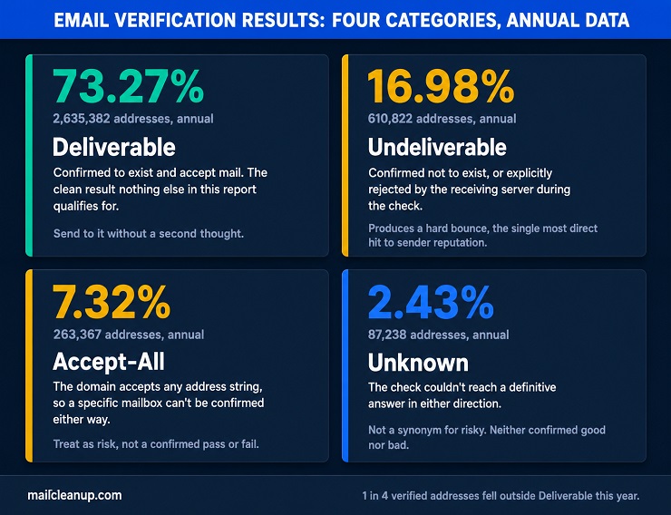
Every one of the 3,596,809 addresses in this dataset landed in exactly one of four categories. Here’s how the full year breaks down.
| Category | Addresses (Annual) | Share of Verified Addresses (Annual) |
|---|---|---|
| Deliverable | 2,635,382 | 73.27% |
| Undeliverable | 610,822 | 16.98% |
| Accept-All | 263,367 | 7.32% |
| Unknown | 87,238 | 2.43% |
Read that table plainly, and the takeaway is this. Roughly one in four addresses verified over the past year, 961,427 of them, did not come back as a clean, confirmed deliverable. That’s not a niche edge case, it’s why email verification statistics matter to anyone building or buying a list. These four categories are this report’s own email verification accuracy statistics, the foundation everything else here builds on. If you send to that other quarter without knowing which category each address falls into, that’s how bounce rates and reputation damage actually happen.
Deliverable, Undeliverable, Accept-All, and Unknown: What These Email Verification Accuracy Statistics Actually Measure
Deliverable means verification confirmed the address exists and can receive mail. You send to it without a second thought.
Undeliverable means the opposite got confirmed. The domain doesn’t exist, the mailbox doesn’t exist on a domain that does, or the receiving server explicitly rejected it. If you send here, you already know the outcome: a hard bounce. Hard bounces are the single most direct hit to your sender reputation on this list.
Accept-All is a different kind of result, not a pass or a fail but an inability to get a definitive answer. The receiving domain is configured to accept mail to any address string. A check can confirm the domain accepts mail, but it can’t confirm whether your specific address is a real, monitored inbox. That uncertainty is why you should still treat accept-all addresses as risky, even though nothing about them technically failed.
Unknown covers everything the check genuinely couldn’t resolve. Most often that’s a receiving server that didn’t respond definitively, or greylisting that delayed a clear answer. Sometimes it’s a mail configuration that blocks the kind of probe verification relies on. You’ll see this result when the check couldn’t confirm a pass or a fail, not when something is actually wrong. Unknown isn’t a synonym for risky the way Accept-All is.
Each result maps to a specific mechanism inside the verification pipeline, the same one your list would go through too. Together they’re the real email verification accuracy statistics behind any marketed percentage. That means syntax checks, MX lookups, the SMTP handshake, and the classification layers on top of it. Email verification features explained covers exactly how each of those checks works and what result it produces. That’s the mechanism-level detail behind the four categories above, if you want to go deeper.
The Annual Picture, and What a Closer Look at This Email Verification Data Shows
Two of the four categories above hold genuinely steady whether you look at the annual figure or the more recent 653,070-address sample. Deliverable moves by 0.61 points, Accept-All by 0.16. Neither looks seasonal or volatile. Whichever window you check, roughly the same share of addresses lands there.
Undeliverable and Unknown move in the opposite direction from each other, and by a comparable amount. The annual Undeliverable rate is 16.98%; in the more recent sample, it’s 13.73%, a 3.25-point drop. Unknown runs the other way: 2.43% annually, 6.13% in the recent sample, a 3.70-point rise. If you’re comparing your own list against this report, read those two shifts together, not separately. Some share of addresses that would have come back as a confirmed Undeliverable in the annual baseline may be landing in Unknown instead. This data can’t confirm that specific mechanism, only the two movements themselves.
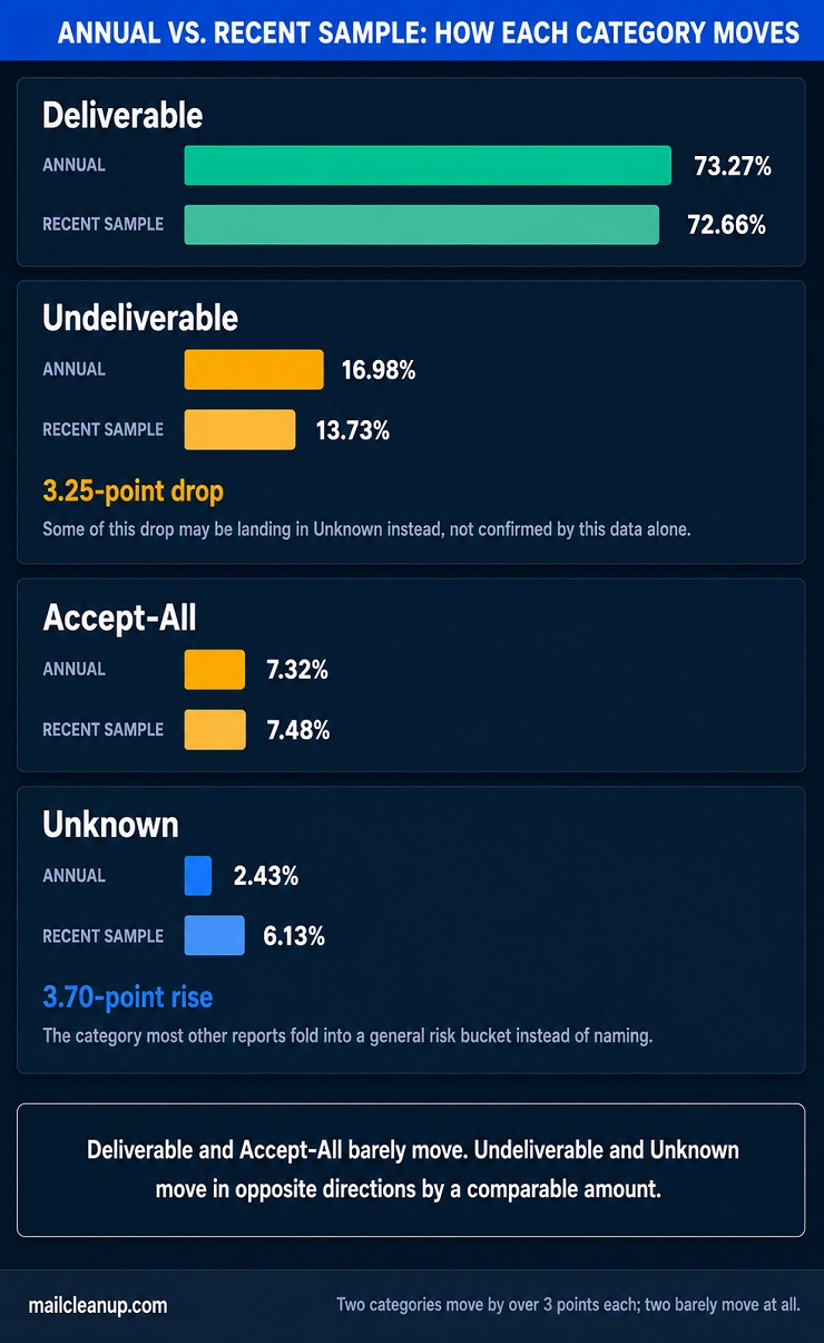
Either way, Unknown is worth flagging specifically because it’s a category most email verification statistics don’t separate out at all. Most reports collapse it into a general “risky” bucket alongside accept-all and disposable addresses. Doing that would hide exactly the kind of shift you’re seeing here, in both directions.
Email Verification Accuracy Statistics: How Much of a List Is Actually Usable
Most email verification tools market an accuracy number. MailCleanup does too, up to 99%, the same shape of claim you’ll see from nearly every tool in this space. None of that is the same as real email verification accuracy statistics computed from a genuine dataset. That number answers a narrower question than it sounds like it does. It tells you how often the tool’s verdict on a given address is correct. It doesn’t tell you what share of your list is actually going to be clean.
Those are genuinely different questions, and real email verification statistics, not a single marketed number, are what actually answer the second one. Across the annual data, 2,635,382 of 3,596,809 verified addresses came back Deliverable. That’s a 4.31-to-1 ratio against Undeliverable addresses alone, and 2.74-to-1 against everything outside the clean Deliverable category. If your list looks anything like this dataset, roughly three in four addresses are usable. The rest need a real decision, not a blanket accuracy percentage.
Deliverable-to-risky ratio, annual: 2.74 to 1. For every 2.74 addresses confirmed clean, there’s one that isn’t.
That ratio is the number worth carrying into your own list. A 99% accuracy claim from any tool, ours included, tells you the tool rarely gets a verdict wrong. It doesn’t tell you what fraction of the addresses you’re about to send to will actually receive that mail. It’s a cleaner set of email verification accuracy statistics than any single marketed percentage provides.
Invalid Email Percentage: What “Undeliverable” Actually Contains
Undeliverable is the largest of the three non-clean categories in this report’s email verification statistics, 16.98% of the annual dataset, 610,822 addresses. That’s the single biggest driver of this report’s own invalid email percentage. It’s also the one most likely already sitting on your own list right now. It’s the one category verification can confirm with certainty, not just flag as a risk.
How many emails are invalid on a typical list comes down almost entirely to this number. Deliverable, Accept-All, and Unknown all leave some room for judgment. Undeliverable doesn’t: the domain doesn’t resolve, the mailbox doesn’t exist, or the receiving server rejected the address outright during the check itself. There’s no ambiguity left for you to interpret.
That certainty is exactly why sending to an undeliverable address costs more than a single failed message. A hard bounce tells the receiving server, and every inbox provider watching your sending pattern, exactly one thing. You’re sending to an address you shouldn’t have had on the list in the first place. Cost of email bounces breaks down what that actually costs beyond the bounce itself, but the short version is that it compounds. One hard bounce is a data problem. A pattern of them is a reputation problem. Reputation is what determines whether your next campaign, to addresses that are genuinely fine, reaches the inbox at all.
Accept-All Rate: Why Some Email Verification Statistics Aren’t a Clean Yes or No
Accept-All sits at 7.32% of the annual dataset, 263,367 addresses that verification couldn’t clear as good or bad. It sits just outside this report’s own invalid email percentage, ambiguous rather than confirmed bad. The domain says yes to everything, so nothing about the check itself failed. That’s exactly the problem you’re left with. A domain configured this way will accept mail addressed to a real inbox and mail addressed to nothing at all. There’s no way to tell which one you’re looking at from the outside.
That’s what makes Accept-All one of the harder lines in any set of email verification statistics to summarize. You have a few real options for handling an address that comes back this way. None of them is treating it the same as a confirmed Deliverable:
- Send cautiously and watch engagement. If the address opens or clicks, it’s real. Silence over several sends is its own signal.
- Exclude it from your first send to a new list. Let your confirmed-deliverable addresses build sending reputation first.
- Weight it into your overall risk tolerance, not treat it as a coin flip on every single address.
Our dedicated guide to catch-all email addresses goes deeper into what makes a domain accept-all in the first place. It also covers how to read the signals once you’ve decided to send anyway.
Unknown Results: The Email Verification Data Category Most Reports Don’t Even Break Out
Unknown accounts for 2.43% of the annual dataset, 87,238 addresses where verification genuinely couldn’t reach a verdict on your address either way. That’s the smallest of the four categories by a wide margin. It’s also the one most other email verification statistics don’t even name, folded instead into a general risk bucket alongside Accept-All and disposable addresses.
The reason it deserves separate treatment is mechanical, not just a matter of labeling. Greylisting is the most common cause you’ll run into. A receiving server temporarily rejects the first delivery attempt on purpose, expecting a legitimate sender to retry. It’s a real, fairly common anti-spam technique, not a flaw in the check. Others come from a server that simply doesn’t respond within the verification window. Some come from a mail configuration that blocks the kind of probe verification depends on. Either way, none of it tells you the address is bad, and none of it confirms it’s good either.
That’s what makes Unknown genuinely different from the other three categories, and why lumping it in with Accept-All misreads it for you. Accept-All at least tells you the domain is configured a specific way, even if a specific mailbox stays uncertain. Unknown tells you nothing conclusive in either direction. Treating it as automatically risky throws away real deliverable addresses right alongside genuinely bad ones. Getting this one category wrong skews any email list quality benchmark you try to build from your own results.
Role-Based, Disposable, and Syntax Error Rates in This Email Verification Data
Three more detection layers sit alongside the four primary categories. Each one is a specific address type that gets tracked and flagged even when it might otherwise pass as Deliverable. These three numbers round out this report’s email list quality benchmark beyond the four categories already covered. Here’s how they break down across the annual dataset.
| Detection Category | Addresses (Annual) | Share of Verified Addresses (Annual) | Rate per 1,000 Verified |
|---|---|---|---|
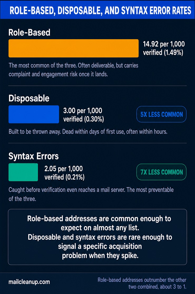
| Role-Based | 53,658 | 1.49% | 14.92 |
| Disposable | 10,776 | 0.30% | 3.00 |
| Syntax Errors | 7,374 | 0.21% | 2.05 |
None of these three carry the same weight. Role-based addresses are the most common of the three by a wide margin. They show up five times more often than disposable addresses, and more than seven times more often than syntax errors. That gap in scale is worth keeping in mind as you read what each one actually means below.
Role-Based Email Rate in This Year’s Email Verification Statistics
A role-based address isn’t tied to one person. info@, sales@, support@, admin@, these go to a shared inbox. Sometimes several people monitor it, sometimes nobody does once the person who set it up moves on. At 1.49% of verified addresses annually, 14.92 per 1,000, role-based results are common, one of the clearer patterns in these email verification statistics. You’ve almost certainly got some on your own list already, especially if any of it came from B2B contact forms or vendor directories. That’s a normal part of any real email list quality benchmark, not a red flag on its own.
Role-based doesn’t mean invalid. Most of these addresses are genuinely deliverable, the mail goes somewhere real. What changes is the risk profile once it lands. A message to a shared inbox is more likely to get marked as spam by whoever happens to open it that day. No single person feels ownership over managing that inbox’s subscriptions. It’s also a weaker signal for personalization and engagement tracking, since you can’t tell which specific person actually read it.
Role-based email addresses dedicated post covers how to identify them beyond the obvious prefixes and what to do with them once you have.
Disposable Email Rate: What These Email List Quality Statistics Show
A disposable address is built to be thrown away, the kind you’ll never get real engagement from. Services like these exist specifically to hand out a working inbox for a few minutes. That’s just long enough to clear an email-verification gate on a signup form before it disappears. At 0.30% of verified addresses annually, 3.00 per 1,000, disposable results show up far less often than role-based ones. Still, you’re looking at a cleaner kind of risk than most categories here. These are the kind of email list quality statistics that matter more for engagement planning than for deliverability risk.
An address that’s disposable today is very likely to be dead within days, sometimes hours. That timeline is what makes disposable addresses different from ordinary decay. A normal address might sit inactive for months before it’s worth removing. A disposable one was never going to engage in the first place. Holding onto it doesn’t buy you anything. It just sits on your list looking like a real contact until the next send finds out otherwise.
What is a disposable email address goes deeper into how these get detected and why they cluster around gated content and free trials specifically.
Syntax Error Rate: How Many Emails Are Invalid Before Verification Even Starts
Syntax errors are the simplest failure on this list and the rarest. The rate is 0.21% of verified addresses annually, 2.05 per 1,000, 7,374 of them across the year. That’s the smallest number in this set of email verification statistics. A syntax error means the address you’re looking at was never a real, checkable email string to begin with. Nothing about mail servers or mailbox existence comes into it. The check fails before verification even gets that far.
That earliness is the point. Every syntax error adds directly to this report’s own invalid email percentage, the most preventable slice of it. These are the addresses a form’s own validation should have caught before they ever entered your list at all. A few patterns account for most of them:
- Domain typos, gmial.com instead of gmail.com, yaho.com instead of yahoo.com
- Missing or misplaced characters, no @ symbol, a trailing period, a stray space
- Copy-paste errors, an address pasted with extra text still attached from wherever it came from
Every syntax error you catch at the point of entry is one you never have to clean up later. That’s exactly why syntax validation sits at the front of MailCleanup’s own verification pipeline, the first check that runs. It catches what’s already broken before anything more expensive gets spent confirming it.
Spam Trap Rate: How Rare, and How Dangerous, This Email Verification Benchmark Really Is
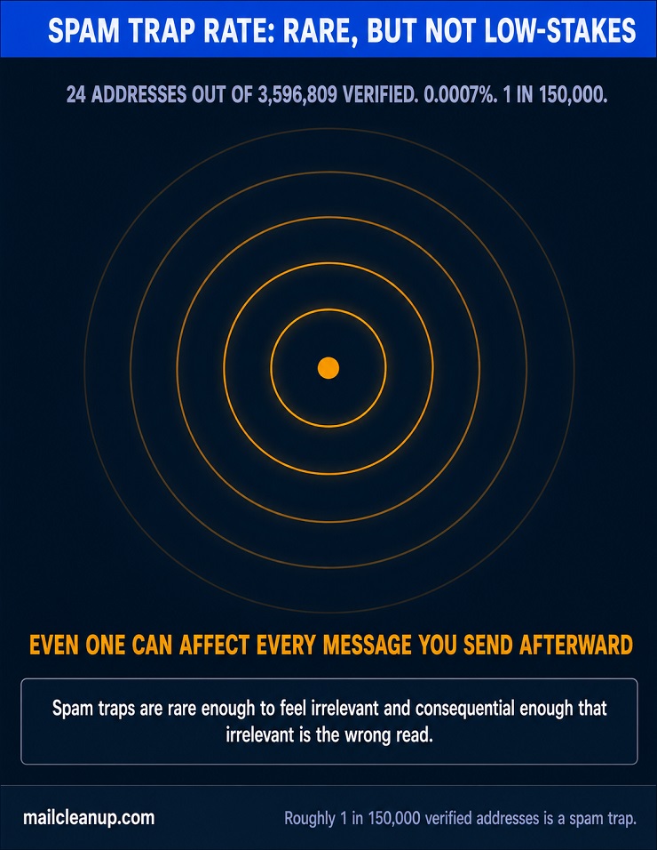
Spam traps are the rarest thing this report tracks by a wide margin. The rate is 0.0007% of verified addresses annually, 6.67 per million, 24 addresses out of 3,596,809 across the entire year. Every other rate in these email verification statistics is measured per thousand. This one needed a bigger denominator just to register as a number at all, which tells you something on its own. It sits so far outside any normal email verification benchmark that per-thousand framing stops being useful.
Don’t let that rarity read as unimportant. It’s the single most extreme data point in this entire email verification benchmark. A spam trap isn’t a risky address the way Accept-All or Unknown are risky. It’s a deliberate signal, placed by an inbox provider or a blocklist operator specifically to catch senders who aren’t managing their lists carefully. Hitting even one can trigger blacklisting that affects every message you send afterward, regardless of how clean the rest of your list actually is. The math here doesn’t average out the way a bounce rate does. One trap in millions of addresses can outweigh everything else in this report.
The guide on spam traps covers the different types you’ll actually encounter, recycled addresses, and pristine traps seeded specifically to catch purchased or scraped lists. It also covers what finding one in your results should tell you about where that list came from.
Is Your List Normal? Using This Email Verification Benchmark to Find Out
Every number in this report works as an email verification benchmark you can check your own list against. You don’t need access to a full set of email verification statistics to use these figures as a reference point. Just your own results from a recent check.
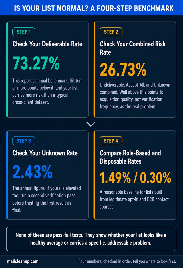
- Start with your deliverable rate. This report’s annual figure is 73.27%. If yours sits meaningfully below that, especially by ten points or more, your list is carrying more risk than a typical cross-client dataset. That single figure is the anchor for this whole email verification benchmark.
- Check your combined risk rate next. Undeliverable, Accept-All, and Unknown together land at 26.73% here. The undeliverable share alone is this report’s clearest invalid email percentage, and it’s the number most worth tracking first. A number well above that points to acquisition quality, not verification frequency, as the real problem. This is really just a more precise way of asking how many emails are invalid or risky across your own list.
- Look at your Unknown rate specifically. This report’s annual figure is 2.43%, though a closer look at recent activity puts it higher. If yours is elevated too, it’s worth a second verification pass rather than assuming the first result is final.
- Compare role-based and disposable rates if you can see that breakdown. This report’s figures, 1.49% and 0.30% respectively, are a reasonable baseline for lists built from legitimate opt-in and B2B contact sources.
None of these comparisons are pass-fail tests. They’re a way to tell whether your list looks like a healthy cross-client average or carries a specific, addressable problem.
What This Email Verification Data Suggests Going Into the Rest of 2026
This report can’t tell you where email quality is headed, not with confidence. That’s a different discipline than what most email verification industry report content even attempts. A single tracked list, re-verified over time, could support that kind of claim, the way the report on email list decay does from its own dedicated dataset. This dataset can’t, since it’s built from different addresses at each scope, not one population followed forward. What it can support is a narrower, honest observation. Something in the most recent activity looks different from the fuller annual baseline. That’s worth planning your next verification cycle around, even without calling it a trend.
The Unknown rate is where this shows up clearest. It sits at 2.43% across the full year, and meaningfully higher in the most recent activity this report can show you. Three explanations are plausible, and none of them are confirmed by this data alone. Receiving servers could be leaning on greylisting more aggressively. The kinds of domains being verified could genuinely be shifting. Or a smaller, more recent sample could simply carry more noise. This report doesn’t resolve which one it is for you.
What it does support is a practical adjustment. If your own verification results show Unknown climbing, don’t treat that the way you’d treat a stable background rate. Watching that shift is itself a form of ongoing email verification benchmark work, not a one-time exercise. Re-check those addresses rather than writing them off in either direction. An Unknown result today may resolve differently on a second pass than it would have a year ago. That’s a genuine, actionable takeaway from these email verification statistics, distinct from a prediction about where the industry is heading.
How to Check Your Own List Against These Email Verification Statistics
This report’s own email verification statistics started as a list that went through the same verification pipeline yours can go through too. Comparing your own results against these numbers only works once you actually have those results. That means syntax, deliverability, accept-all, and unknown rates, broken out the same way this report breaks them out.
MailCleanup’s own bulk verification process runs your list through the same checks behind every number in this report. No account required, no subscription, a straightforward per-address cost regardless of list size. Email list hygiene guide covers what to actually do with the results once you have them. That includes which addresses to remove outright, and which ones are worth a second look before you decide.
This report will get updated periodically as new data becomes available, staying current as an email list quality benchmark rather than a fixed snapshot. The specific percentages may shift a little from one year to the next. What won’t change is the value of knowing your own numbers instead of assuming your list looks like anyone else’s. That comparison is the whole point of treating this report as an email list quality benchmark in the first place.
FAQs on Email Verification Statistics
What percentage of email addresses are typically invalid?
In MailCleanup’s 2026 Quality Report, the invalid email percentage sits at 16.98% of 3,596,809 verified addresses across the annual dataset. That’s the largest single risk category tracked. Add Accept-All and Unknown results, and 26.73% of addresses needed more than a simple pass. Rates vary by acquisition source, but this is real verification data, not a modeled estimate.
How accurate is email verification?
Most tools market accuracy as a single percentage, often up to 99%. That measures how often a verdict is correct, not how much of your list is clean. Real email verification accuracy statistics, not a single marketed number, answer the second question. MailCleanup’s own annual data shows a 2.74-to-1 ratio of deliverable to risky addresses.
What does it mean when an email verification result is unknown?
Unknown means the check couldn’t confirm a pass or a fail, usually because a server didn’t respond or greylisting delayed an answer. It isn’t the same as risky. In these email verification statistics, Unknown results sit at 2.43% across the annual data. A closer look at recent activity shows this climbing higher.
How rare are spam traps in a typical email list?
Genuinely rare. MailCleanup’s 2026 annual data found spam traps at 6.67 per million verified addresses, just 24 out of 3,596,809 across the year. That’s a level of detail most email verification industry report content doesn’t break out. That rarity doesn’t make them low-stakes. A single spam trap hit can trigger blacklisting that affects every message you send afterward, regardless of overall list quality.
How often should you verify your email list?
Cadence should track how fast your list decays, not a fixed calendar rule. These email verification statistics show measurable differences between a full year of activity and a more recent slice. That’s exactly why a one-time check goes stale. Re-verify before major sends, and more often for lists built from public forms.
What is a good email verification benchmark to aim for?
MailCleanup’s 2026 annual data puts deliverable addresses at 73.27% of a real, cross-client dataset, a reasonable reference point rather than a pass-fail line. If your own list falls meaningfully below that, especially in the Unknown category, it’s worth checking your acquisition sources. That’s worth doing before your next send goes out.