

Email deliverability had a good year. The global average inbox placement rate climbed through 2025, then kept climbing into the first half of 2026. If your own numbers didn’t move the same way, that gap is worth understanding rather than ignoring.
None of that improvement guarantees your own program is one of the ones getting better. An industry-wide average is exactly that: an average. It’s built from senders who are compliant and senders who aren’t. It spans Gmail’s high-80s and Microsoft’s high-70s, the top-performing industries clearing 95% and the bottom ones struggling to hold 80%. Where your own program actually falls in that range has far more to do with decisions inside your own list and sending practices. It has much less to do with which year it happens to be.
This is the real state of email deliverability heading into the back half of 2026, and what it means for you specifically. What’s actually improved, what hasn’t, and which numbers you should actually be paying attention to.
TL;DR
- Global average inbox placement rate reached 87.2% across full-year 2025, up 3.7 percentage points, and kept climbing into 2026.
- Gmail leads the major mailbox providers at an 89.8% inbox placement rate, while Microsoft trails at 77.4%.
- Industry is one of the biggest swing factors in deliverability, ranging from Transportation’s 97.2% down to Real Estate’s 80.1%.
- Published industry benchmarks don’t always agree: one widely-cited source puts retail’s inbox placement rate at roughly 80%, another at 90.4%, for the same year.
- Europe posted the strongest regional average at 91.1%, while South America posted the largest year-over-year improvement, up 10.6 percentage points.
- Even inbox placement rate’s own formula is disputed: some sources divide by emails sent, others by emails delivered, producing different results from identical data.
- No email marketing platform publishes a measured inbox placement rate of its own, since list quality affects the number more than platform choice does.
Global Email Deliverability Benchmarks in 2026
Inbox placement kept improving into 2026. A tested set of major providers gained 6.02 percentage points in the first half of 2026 compared to the first half of 2025. Every major free provider tracked showed a gain, and these email deliverability statistics are among the clearest signs of that.
| Period | Average Inbox Placement (tested providers) |
|---|---|
| H1 2025 | 42.98% |
| H1 2026 | 49.00% |
| Change | +6.02 pts |
Source: GlockApps, Email Deliverability Benchmark Report H1 2026 vs H1 2025.
That H1 2026 read comes from seed-list testing. The method checks how mail lands at specific test inboxes rather than measuring your own full live volume. That’s why the absolute percentages above will likely run lower than what you actually see on a well-configured commercial program. Read the direction of the change as the useful signal here, not the raw number on its own.
For the fuller picture of what you can realistically expect from a well-run program, the most complete year-over-year benchmark still available covers all of 2025. It shows a global average inbox placement rate of 87.2%, up 3.7 percentage points from the year before. That figure is drawn from a much larger set of real commercial sending programs rather than seed tests. It’s closer to the population your own program actually sits in.
| Metric | 2025 Global Average |
|---|---|
| Inbox placement | 87.2% |
| Spam placement | 6.6% |
| Missing (blocked/deferred) | 6.1% |
Source: Validity, 2026 Email Deliverability Benchmark Report (full-year 2025 data).
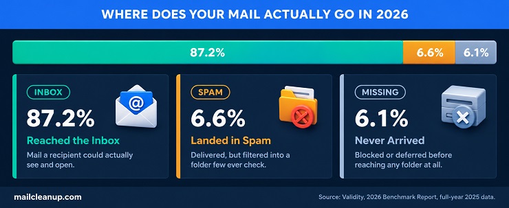
Both signals point the same direction even though their absolute numbers differ. That improvement tracks closely with a wave of mandatory changes across the industry, one of the clearest email deliverability trends of the past two years. Gmail and Yahoo’s bulk sender requirements had already pushed high-volume senders toward stricter authentication and lower complaint rates. Microsoft introduced its own version partway through 2025. If you’d already adapted to Gmail and Yahoo’s rules by then, you picked up the benefit almost immediately once Microsoft started enforcing too.
New-generation privacy laws added a second push in the same direction, particularly across Europe and a growing list of US states. They reward you for treating consent and data quality as an ongoing program rather than a one-time formality.
One trend sits underneath the 2025 improvement, and it’s easy to miss. Global sending volume actually fell year over year for the first time on record, even as placement rates rose. Senders appear to be sending less, more deliberately, rather than more. The same shift is worth considering for your own program if you haven’t already made it. Fewer, better-targeted campaigns to a smaller, engaged list will very likely outperform sending broadly to everyone you have and hoping enough of it lands.
None of these email deliverability statistics mean an 87.2% baseline applies to your own program. It’s a global average across every provider, every industry, and every region tracked at once. Each of those three variables moves the number by double digits in either direction, sometimes more. That’s the real state of email deliverability heading into 2026 for you. Genuine improvement sits at the top line, with far more variation underneath it than a single average can tell you. The next three sections break down exactly how much, and where you actually fit into it.
Email Deliverability Benchmarks by Mailbox Provider: Gmail, Yahoo, Outlook & Apple
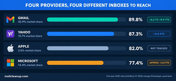
The mailbox providers your list actually reaches matter as much as any factor you control directly. The four largest, Gmail, Microsoft, Yahoo, and Apple, cover more than three-quarters of the global inbox landscape between them. Their individual placement rates differ by double digits. The state of email deliverability is a genuinely different question for you depending on where your own list actually sends. Delivery, authentication, and sender reputation are the drivers behind why these numbers move at all. Our guide to what email deliverability actually measures covers the mechanics in full.
| Provider | 2025 Inbox Placement (full-year) | 2025 YoY Change | H1 2026 Change vs. H1 2025 | Market Share |
|---|---|---|---|---|
| Gmail | 89.8% | +2.6 pts | +6.6 to +8.9 pts | 42.9% |
| Yahoo | 87.3% | +1.3 pts | +4.4 pts | 15.7% |
| Apple | 82.0% | +5.7 pts | Not tracked | 3.6% |
| Microsoft (Outlook/Hotmail) | 77.4% | +1.8 pts | approx. +6.0 pts | 14.4% |
Sources: Validity, 2026 Email Deliverability Benchmark Report (full-year 2025 data); GlockApps, Email Deliverability Benchmark Report H1 2026 vs H1 2025 (seed-test data; Apple not tracked).
Two things stand out together in this email deliverability benchmark data. Gmail leads on both measures, the highest 2025 baseline and the single biggest 2026 gain. Microsoft sits at the bottom of the full-year number despite a real improvement of its own already underway. The four sections below walk through each provider individually, what’s actually behind your number and where it’s headed next.
Some sources label this kind of provider-by-provider comparison an email deliverability ESP benchmark. This piece uses “mailbox provider” throughout instead. ESP more commonly refers to the platform you send from, Mailchimp or Klaviyo, not the service that receives your mail. Both terms point at the same Gmail-Yahoo-Outlook-Apple breakdown below.
Gmail
Gmail is the single largest mailbox provider in the world. If your list has any real size to it, most of your subscribers are probably sitting there right now. It handles 42.9% of the global market on its own. Across full-year 2025, its inbox placement rate came in at 89.8%, up 2.6 percentage points from the year before. That puts the state of email deliverability at Gmail well ahead of the global average by default. That holds if Gmail is where most of your list lives.
Much of that improvement tracks back to Google and Yahoo’s bulk sender requirements, in force since 2024. If you’re already compliant with those, you’re benefiting from stricter authentication and lower complaint rates. A lot of your competitors still haven’t caught up on that.
Gmail didn’t stand still on the product side either. A Manage Subscriptions feature, a dedicated Purchases tab, and an engagement-sorted view of the Promotions tab all shipped in 2025. Each one gives Gmail more signal about whether your subscribers actually want to hear from you. The integration of Gemini into Gmail, announced going into 2026, adds AI-driven prioritization on top of that. If your program already has strong engagement, your messages get surfaced more prominently. If it doesn’t, you’ll likely feel that the opposite way.
That last point is worth sitting with. As mailbox providers reward engagement more directly, the gap between strong and weak senders inside Gmail specifically is likely to widen rather than narrow. If a meaningful share of your own list sends to Gmail addresses, that widening gap is worth watching closely. It holds even if the overall average stays steady.
Microsoft (Outlook, Hotmail & Live.com)
For Microsoft, the state of email deliverability looks tougher than anywhere else among the major providers. If Outlook or Hotmail addresses make up a real share of your list, temper your expectations against this number rather than Gmail’s. Its full-year 2025 inbox placement rate came in at 77.4%, the lowest of the four. It still represents a 1.8 percentage point improvement over the year before. Microsoft was also the last of the major providers to introduce mandatory bulk sender guidelines, rolling them out partway through 2025. If you’d already adapted to Gmail and Yahoo’s requirements by then, you likely saw a visible jump in your own Microsoft placement. That’s once Microsoft’s own enforcement began.
Microsoft’s Sender Reputation Data program is drawn from a periodic survey asking your actual recipients whether the marketing email they received was wanted or junk. It plays a bigger role here than at other providers. It’s a genuine engagement signal, closer to a satisfaction survey than a spam filter. That means fixing your authentication won’t move this number on its own if your Outlook engagement is genuinely weak. You have to earn it from your recipients directly.
Yahoo
Yahoo’s full-year 2025 inbox placement rate reached 87.3%, a smaller 1.3 percentage point gain than Gmail or Apple posted. The state of email deliverability at Yahoo carries a real caveat you should know about before you benchmark against it. Part of the flatter trajectory traces to a dip in the middle of the year. That coincided with the early stages of migrating AT&T and Comcast email accounts onto Yahoo’s own infrastructure, a process still in progress. Those two providers reported considerably lower placement rates on their own, in the 76 to 80% range. If any of your subscribers use an AT&T or Comcast address, expect that migration to soften your own numbers there before it eases.
If you’re targeting Yahoo inboxes specifically, also account for the platform’s policy of permanently deleting accounts inactive for 12 months or more. A list segment that looked healthy to you a year ago may already contain addresses Yahoo has quietly closed on you.
Apple
Apple Mail posted the largest year-over-year improvement of any major provider across full-year 2025, climbing 5.7 percentage points to 82.0% inbox placement. That’s one of the more notable email deliverability trends in this whole dataset. It says something specific about the state of email deliverability at Apple this year. Unlike Gmail, Yahoo, and Microsoft, Apple has never introduced its own mandatory bulk sender requirements. The most likely explanation is a halo effect. You and every other sender cleaned up your programs to satisfy the other three providers.
Apple Mail benefited from those same improved practices without needing to enforce anything itself. No current seed-test data breaks Apple Mail out separately, since it isn’t one of the major free providers tracked in the most recent testing round. You won’t find a 2026-specific figure to compare yourself against yet. Every other email deliverability benchmark in this piece still applies to your own Apple-bound mail.
Apple’s own product changes point toward more of the same going forward. A redesigned Mail app rolled out across macOS and iPadOS in 2025. Apple Intelligence now actively sorts your recipients’ incoming mail by priority based on their own behavior. Neither change is a deliverability requirement in the way Gmail’s or Microsoft’s rules are. Both push in the same direction, though, and mailbox providers everywhere are converging on engagement as the signal that matters most, mandate or not. The same list-quality work that helps you with Gmail and Microsoft will help you here too.
Email Deliverability Benchmarks by Industry
Industry is one of the biggest swing factors in the state of email deliverability. It’s probably bigger than you’d expect if you’ve only ever benchmarked yourself against one global number. The gap between the strongest and weakest sectors runs a full 17 percentage points on identical methodology. That gap means an industry-agnostic “good inbox placement rate” benchmark won’t tell you much until you know which industry it’s describing, and whether that’s yours.
| Industry | 2025 Inbox Placement |
|---|---|
| Transportation | 97.2% |
| Energy, Utilities & Waste | 95.0% |
| Telecommunications | 92.6% |
| Government | 91.4% |
| Travel & Hospitality | 90.8% |
| Insurance | 90.4% |
| Retail | 90.4% |
| Holding Companies | 90.2% |
| Manufacturing | 89.9% |
| Finance | 88.8% |
| Hospitals & Physicians | 88.4% |
| Media & Internet | 88.1% |
| Organizations (Nonprofit/Membership) | 87.7% |
| Education | 87.6% |
| Construction | 86.5% |
| Software | 85.7% |
| Business Services | 85.1% |
| Law Firms | 82.1% |
| Consumer Services | 81.2% |
| Healthcare Services | 80.3% |
| Real Estate | 80.1% |
Source: Validity, 2026 Email Deliverability Benchmark Report (full-year 2025 data).
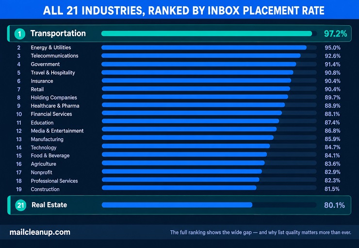
Find your own industry in that email deliverability industry benchmark table before you read any further. The two patterns underneath it will mean different things depending on where you land. Regulated, high-trust sectors, transportation, utilities, telecom, government, cluster at the top. If you’re in one of these, your email likely carries genuine operational value: a shipping update, an outage notice, an account alert. That’s the kind of thing recipients open and engage with rather than mark as spam. Sectors built around high sending volume to colder or more transactional relationships, real estate, consumer services, healthcare services, cluster at the bottom. If that’s you, the rest of this section is worth reading closely.
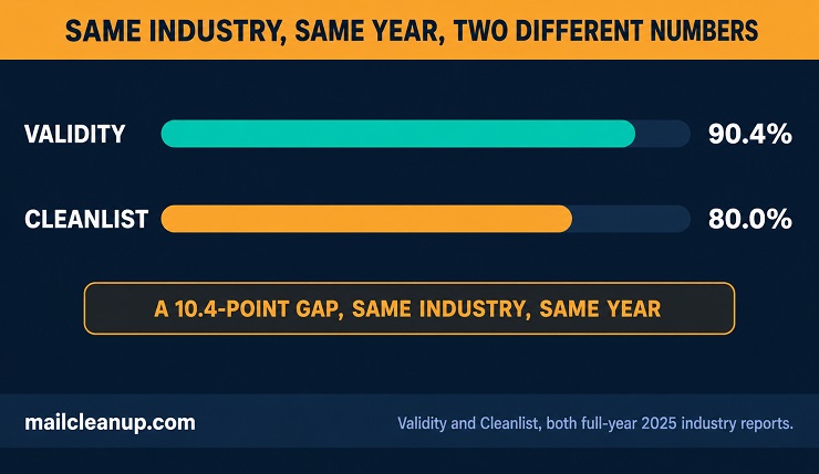
Cross-referencing a second, independent benchmark source on this same question surfaces something worth flagging honestly. It matters especially if you’re about to cite one of these numbers yourself. A separate industry benchmark puts retail at roughly 80% inbox placement, not the 90.4% shown above from the same year. Same industry, same general period, an entire 10-point gap between two real sources. Neither figure is wrong on its own terms. They’re measuring different senders across different methodologies. That’s exactly why this piece states its source under every table rather than handing you a single number as the industry’s one true figure.
If your own program sits in one of the industries not near either extreme, business services, software, education, construction, you’re in luck. Your state of email deliverability probably tracks close to the global 87.2% average. That makes the global figure a genuinely useful number for you to benchmark against. It’s far less useful if you’re at either tail, where it will undersell or oversell you depending on which end you’re on.
Where Email Deliverability Benchmarks Are Strongest
Transportation leads every tracked industry at 97.2% inbox placement, nearly 10 points above the global average. It’s where the state of email deliverability currently looks healthiest overall. Energy, utilities, and waste management follows closely at 95.0%. Telecommunications, government, travel and hospitality, and insurance round out the top tier, all clearing 90%.
What connects them isn’t obvious at first glance, since sending volume and audience size vary widely across this group. Engagement quality is the common thread instead. A shipping notification, a flight delay alert, or a utility outage warning gets opened because it’s operationally relevant to the recipient. It’s not because of the sender’s own list hygiene or authentication setup. If your program sits in one of these industries, you should genuinely expect to outperform this email deliverability benchmark, not just match it. If you’re not currently outperforming it, that’s worth investigating rather than accepting.
Bounce rate and inbox placement tend to move together within an industry for the same reason. If bounce rate specifically is what you’re trying to benchmark, our industry breakdown of bounce rates will be the more direct comparison once it’s live.
Where Email Deliverability Benchmarks Are Weakest
Real estate sits at the bottom of the tracked industries, at 80.1% inbox placement, with healthcare services close behind at 80.3%. This is where the state of email deliverability currently looks toughest. If either is your industry, the number you should hold yourself against is lower than you might think.
Consumer services and law firms both land in the low 80s too. What you and everyone else in these sectors share is a structural challenge the top performers don’t face. Much of your email goes to recipients with a weaker, more transactional relationship to you. Think a one-time home search, a single legal consultation, or an appointment reminder someone might not open until after the fact. Those weaker engagement signals compound over time, and mailbox providers use exactly those signals to decide where your mail lands next.
None of this means you’re capped at 80% just because of your industry. It means the baseline you should benchmark yourself against realistically sits lower than the global average. Outperforming that realistic baseline is a far more useful goal for you than chasing a number built from an entirely different industry’s mix of senders.
Email Deliverability Benchmarks by Region
Regional deliverability diverges nearly as much as industry does, and the pattern isn’t the simple “wealthier regions perform better” story you might expect. This email deliverability region benchmark starts with Europe. Europe posted the strongest average among the major regions tracked in 2025, at 91.1% inbox placement, nearly 4 points above the global figure. If a meaningful share of your list sits in Europe, you’re likely already benefiting from that. Asia followed at 86.4%, close to the global average on its own.
That regional figure will hide real internal spread if any of your own subscribers are there. Germany and France, both well above 90%, sit inside the same broad reporting structure as markets performing considerably lower. Validity’s regional groupings pool countries with genuinely different infrastructure and spam-filtering maturity under one label.
South America posted the largest year-over-year improvement of any region, up 10.6 percentage points to reach 88.0%, faster growth than anywhere else tracked. It’s one of the clearest email deliverability trends in this year’s regional data. It’s worth watching closely if any part of your own list sends into that region. North America landed at 86.7%, essentially in line with the global average despite hosting Gmail, Yahoo, and Microsoft’s home markets. That’s worth remembering the next time you assume “domestic” automatically means “easier.” Oceania came in at 87.9%.
| Region | 2025 Inbox Placement | Year-over-Year Change |
|---|---|---|
| Europe | 91.1% | +2.0 pts |
| South America | 88.0% | +10.6 pts |
| Oceania | 87.9% | +3.0 pts |
| North America | 86.7% | +1.7 pts |
| Asia | 86.4% | +8.3 pts |
Source: Validity, 2026 Email Deliverability Benchmark Report (full-year 2025 data).
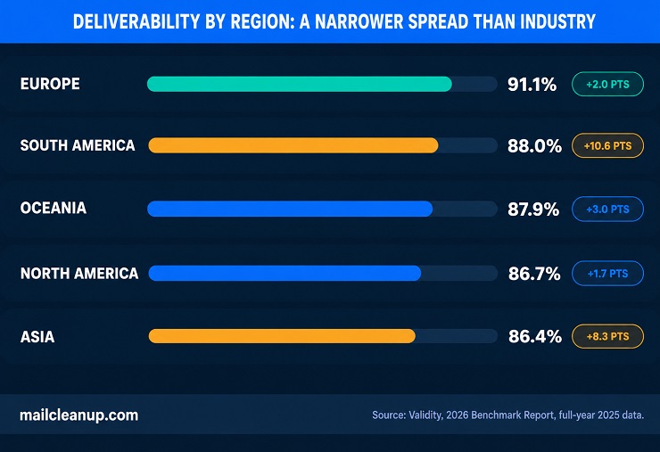
South America’s improvement is the standout figure in these email deliverability statistics, and it’s worth explaining rather than just handing to you as a number. A double-digit year-over-year gain at a regional scale usually reflects infrastructure catching up rather than a single policy change. More mailbox providers in the region are likely adopting the same authentication and filtering standards Gmail, Yahoo, and Microsoft already enforce elsewhere. That’s good news if you send there. Asia’s 8.3-point gain likely reflects something similar in this email deliverability benchmark data. Europe’s smaller 2.0-point improvement makes sense in that light too. A region already performing at 89% or better in the prior year leaves you less room left to close.
At the country level, your own state of email deliverability could vary even more sharply than these five regional averages suggest. Germany posted the highest tracked rate at 97.5%, ahead of France at 94.0% and the UK at 91.5%. The US came in at 86.8%, close to the broader North American average, while India tracked closer to 71%. That’s a reminder that a single regional figure can flatten enormous underlying variation you’d otherwise miss. If you’re targeting a specific country, weight that country’s own figure over its broader regional average whenever you have one available. Don’t assume the regional number alone tells you enough.
Inbox Placement Rate vs. Delivery Rate: The Formula Behind Each
You already know delivery and deliverability answer different questions. What most guides skip is the actual math behind each number. That gap matters the moment you try to calculate your own for your program. Get the formula wrong, or use one a source didn’t disclose, and you’ll benchmark yourself against a number that was never measuring what you think.
Delivery rate is the simpler of the two, and it’s a calculation your own sending platform already runs for you.
Delivery Rate = (Emails Sent − Bounced Emails) ÷ Emails Sent × 100
Send 10,000 emails, and 150 bounce, and your delivery rate is 98.5%. That number only tells you the receiving server accepted your message. It says nothing about whether a human on your list ever actually saw it.
Inbox placement rate is where you need to slow down, because published sources don’t even agree on the formula, not just the benchmark number. Validity, the source behind most of the benchmark figures in this piece, defines it as emails delivered to the inbox divided by total emails sent. MailReach and several other sources define the identical-sounding metric as emails in the inbox divided by emails delivered, not sent. Those are two different denominators, and they’ll produce two different answers from your exact same underlying data.
Here’s what that actually does to your own number if you run it both ways. Say you send 10,000 emails. 150 bounce, leaving 9,850 delivered. Of those, 9,000 land in the inbox.
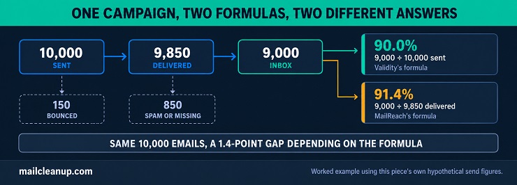
| Formula | Calculation | Result |
|---|---|---|
| Inbox ÷ Sent (Validity’s definition) | 9,000 ÷ 10,000 | 90.0% |
| Inbox ÷ Delivered (MailReach’s definition) | 9,000 ÷ 9,850 | 91.4% |
Same campaign, same raw numbers, a 1.4-point gap between two answers to what sounds like the same question. That gap only grows as your own bounce rate does. If you’re comparing your inbox placement rate against a published benchmark, check which formula that source actually used first. Most won’t tell you directly, which is itself worth treating as a caution flag on the number.
That’s the real state of email deliverability measurement for you: two legitimate formulas, both defensible, both producing a different answer from your identical data. Once you’ve got your own number calculated correctly, tracking it over time is where the real value shows up. Benchmarking your own improvement against your own history is a deeper topic than formula mechanics alone. Our guide to email deliverability rate covers exactly that.
Which Email Marketing Services Actually Support Better Inbox Placement Rates
If you’re choosing between Mailchimp, Klaviyo, SendGrid, or another platform partly on deliverability grounds, here’s the honest starting point for your decision. It’s not something these email deliverability statistics can settle for you. Nobody publishes a real, measured inbox placement rate by platform. That itself tells you something about the state of email deliverability data at the platform level. Your own deliverability depends far more on your list quality, sending practices, and content than on which platform sends the message for you. Two accounts on the identical platform can post wildly different placement rates based on nothing but how each one is actually run.
What you can compare, and what actually matters for your decision, is deliverability infrastructure. That’s the tools each platform gives you to protect your own placement, not a rate the platform can’t actually control on your behalf.
| Platform | Authentication Support | Dedicated IP Option | List Hygiene Tools | Deliverability Dashboard |
|---|---|---|---|---|
| Mailchimp | SPF, DKIM, DMARC (guided setup) | Yes, high-volume senders only, extra fee | Basic bounce handling | Not available |
| Klaviyo | SPF, DKIM, custom sending domain | Yes | Bounce and complaint reporting | Inbox placement estimates included |
| SendGrid | SPF, DKIM, domain authentication | Yes, standard on paid tiers | Automatic bounce/complaint suppression | Feedback loop data included |
| Brevo | SPF, DKIM, DMARC | Yes | Built-in list validation | Available on higher tiers |
| ActiveCampaign | SPF, DKIM, DMARC | Yes | Built-in list cleaning | Available on higher tiers |
If you’re currently on Mailchimp, this table probably confirms something you’ve already suspected about your own setup. It covers the fundamentals but stops there. You get no centralized deliverability dashboard and no spam-complaint data surfaced to you directly. Its dedicated IP option is gated behind both a volume minimum and an extra cost. That’s not a knock on Mailchimp’s core product, which plenty of businesses like yours run successfully. It’s specifically about how much visibility you get into your own placement without leaving the platform.
Klaviyo and SendGrid both give you more to work with if deliverability visibility matters to you specifically. Klaviyo’s own reporting surfaces bounce rates, spam complaints, and inbox placement estimates directly, so you’re not guessing at your own standing between campaigns. SendGrid leans harder into the technical side for you. Feedback loop access and dedicated IP infrastructure are both easier for you to reach without an enterprise-tier upgrade. Which one fits you depends on whether you’re running consumer marketing campaigns or transactional, developer-facing sends. It doesn’t depend on which one has objectively “better” deliverability in the abstract.
None of this changes the underlying point for you, though. No email deliverability benchmark in this piece matters much if your own list is full of dead addresses. No dashboard on any of these platforms will fix your placement for you. You still have to send to people who actually want to hear from you, on a list you’ve actually maintained yourself. That holds regardless of which logo sits on your sending platform.
List Quality: The One Variable Behind Every Inbox Placement Rate Above
Every number in this piece so far describes something outside your control. You didn’t set Gmail’s engagement thresholds, decide which industry carries the strongest baseline placement, or draw your own market’s regional boundaries. List quality is different. It’s the one variable behind every inbox placement rate this piece has shown you. It moves the needle regardless of which provider, industry, or region your list actually sits in. That’s the real state of email deliverability underneath every table above.
Here’s the mechanism. Every list accumulates dead weight over time, in a few predictable forms:
- Hard-bounced addresses: the inbox no longer exists, but the address is still sitting on your list
- Dormant inboxes: technically valid, but nobody’s opened your mail there in months or years
- Spam trap addresses: never real subscribers at all, planted specifically to catch senders who don’t verify what they’re sending to
Mailbox providers watch how often your sends hit addresses like these. A rising bounce rate reads as a sign you’re not managing your own list. It reads that way to Gmail, Yahoo, Microsoft, and Apple alike, regardless of which benchmark above you’re being measured against.
MailCleanup’s own verification data shows why this matters at scale, not just in theory.
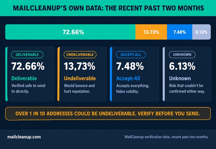
That undeliverable share alone, well over one in ten addresses in a typical unverified list, is enough to visibly damage your placement. That’s true even if it goes uncaught and you send to it anyway.
The fix isn’t complicated, even if it’s easy to let slide. Verify your list before a send, not after a bounce or complaint has already dented your reputation. That catches the addresses most likely to hurt you before they ever leave your sending infrastructure. You’ll see the difference in your very next campaign’s numbers, not three months from now. Our full guide to email list hygiene covers the actual cleaning and maintenance process in depth. That includes how often you should be running it for your own sending volume.
This is also where a tool like MailCleanup fits into your own workflow specifically. Running your list through verification before you send catches the invalid, risky, and trap addresses described above. It does that without requiring you to change platforms or rebuild your sending infrastructure to get there.
Where to Go From Here With Your Own Email Deliverability Benchmarks
You came into this piece with one number in mind, probably your own inbox placement rate. You’re leaving with a lot more context around it than a single global average could give you. Here’s the real state of email deliverability as it applies to you specifically, based on where you sit against everything above.
If your program is underperforming its industry and regional baseline from the sections above: list quality is the fastest thing to check first. It’s also the most likely place a quick win is actually sitting. A verification pass before your next send will tell you within days whether that’s your real problem, not months.
If you’re already clean on list quality and still seeing weaker placement than these benchmarks suggest you should: look at the provider breakdown again with your own list’s makeup in mind. A list skewed heavily toward Microsoft addresses will read differently against these numbers than one skewed toward Gmail. The fix looks different depending on which one you’re actually facing.
If you’re choosing a sending platform partly on deliverability grounds: remember what the platform comparison above actually found. The tools matter less than what you do with them. Pick based on the infrastructure and reporting that fit how you work. Then put the same list-quality discipline behind it regardless of which platform you choose.
If you’re already ahead of every benchmark in this piece: the honest next step is simpler than it sounds. Keep testing and verifying at the same pace. Deliverability is a moving baseline, not a badge you earn once and keep. The senders sitting at the bottom of these numbers a year from now will largely be the ones who assumed today’s good number was permanent.
FAQs on the State of Email Deliverability
What is the average email deliverability rate in 2026?
Global average inbox placement rate reached 87.2% across full-year 2025, up 3.7 percentage points year over year, per Validity’s 2026 benchmark report. The most current seed-test data shows continued improvement into 2026, up another 6.02 percentage points in the first half of the year. Your own number will vary by industry, region, and provider.
Which mailbox provider has the best email deliverability?
Gmail leads the major mailbox providers at an 89.8% inbox placement rate for full-year 2025, per Validity’s benchmark data. Yahoo follows at 87.3%, Apple at 82.0%, and Microsoft at 77.4%. Every major provider improved year over year, with Apple posting the largest single gain among the four.
Which industries have the best email deliverability?
Transportation leads all tracked industries with a 97.2% inbox placement rate, followed by energy and utilities at 95.0%, per Validity’s 2026 report. Real estate and healthcare services sit at the bottom, both near 80%. That 17-point spread means an industry-specific benchmark matters more than one global average.
Does email deliverability vary by region?
Yes, significantly. Europe posted the strongest regional inbox placement rate in 2025 at 91.1%, while South America showed the largest year-over-year improvement, up 10.6 percentage points. Country-level figures vary even more sharply, from Germany’s 97.5% down to India’s roughly 71%.
Does my email marketing platform affect my deliverability?
Less than most senders assume. No platform publishes a real, measured inbox placement rate. List quality and sending practices affect the number far more than which platform sends the message. What genuinely differs between platforms is deliverability infrastructure: authentication support, dedicated IP options, and reporting depth.
What’s the difference between delivery rate and inbox placement rate?
Delivery rate is (emails sent minus bounced) divided by emails sent, confirming a message was accepted. Inbox placement rate measures whether it actually reached the inbox. Published sources even disagree on its formula: some divide by emails sent, others by emails delivered, producing different answers from identical data.