
Most email marketers are tracking the wrong things. Not because they are careless, but because the default dashboard in every ESP makes it easy to focus on the numbers that look impressive rather than the numbers that actually reflect campaign health. Open rate sits at the top of the report. Click-through rate gets watched closely after every send. Bounce rate gets reviewed when something breaks. Everything else is background noise.
The problem is that this approach leaves the most important email marketing KPI signals either unread or misread. A 42% open rate is not a sign your emails are landing well when Apple Mail Privacy Protection has been inflating that number for every sender since 2021. A low bounce rate is not proof your list is clean when soft bounces are being suppressed by your ESP settings. A strong click-through rate does not mean your programme is generating revenue if no one is converting after the click.
This guide covers every important email marketing KPI, explains what each one actually measures, shows you how to read benchmarks correctly, and gives you a framework for using email marketing analytics to make decisions that improve your programme rather than just your dashboard numbers. If you are just getting started with the channel, our email marketing guide covers the strategy foundation. This post covers the measurement layer in full.
TL;DR on Email Marketing KPIs & Metrics
- Email marketing KPIs and metrics are not the same thing: a KPI is a metric tied to a specific business goal, not just any number your ESP surfaces in a report.
- Open rate has been unreliable as a standalone email marketing KPI since Apple Mail Privacy Protection launched in 2021, inflating reported opens for roughly 58% of all email clients globally.
- Click-to-open rate is the most reliable engagement email marketing KPI post-MPP because it measures behaviour after the inbox and is not distorted by privacy prefetching.
- Every important email marketing KPI sits in one of three tiers: deliverability and list health, engagement, or revenue and business outcomes.
- Email marketing benchmarks vary significantly between data sources, so your own historical baseline is more useful than any cross-industry average.
- A dirty list suppresses every email marketing KPI simultaneously: bounce rate rises, inbox placement falls, engagement drops, and ROI collapses.
- Spam complaint rate is the most undermonitored email marketing key metric in bulk sending: exceeding 0.1% triggers scrutiny from major inbox providers and damages deliverability for all future sends.
- Choosing the right email marketing KPI for your programme starts with defining your goal first, then identifying which metric most directly reflects progress toward it.
Email Marketing Metrics and KPIs Are Not the Same Thing
This is the distinction most posts skip, and it is the reason so many email programmes get optimised for the wrong outcomes.
An email marketing metric is any measurable data point your ESP reports. Open rate is a metric. Click rate is a metric. Delivered count is a metric. You can have a reporting dashboard with thirty of them running simultaneously and still have no clear picture of whether your email programme is working.
An email marketing KPI is a metric you have chosen because it directly reflects success or failure against a specific goal. The same metric can be an email marketing KPI for one sender and irrelevant noise for another. If your goal is to grow website traffic from email, click-through rate is an email marketing KPI for you. If your goal is to reduce deliverability risk, bounce rate and spam complaint rate are your KPIs. If your goal is revenue, conversion rate and return on investment are the numbers you manage everything else around.

The practical consequence of confusing them:
A team that tracks everything but has prioritised nothing will run subject line A/B tests to improve open rate while their spam complaint rate climbs quietly past the danger threshold. They will celebrate list growth while ignoring that a third of new signups are invalid addresses. They will report a strong ROI for one quarter without being able to explain why conversions fell the next.
When you separate metrics from KPIs, you stop reacting to noise and start managing the signals that connect directly to your business outcomes. Email marketing analytics becomes a decision-making tool rather than a reporting exercise. That is the practical goal of everything in this guide.
The Email Marketing KPI Hierarchy
The most useful way to think about email marketing KPIs is not as a flat list but as a three-tier hierarchy. Each tier measures a different layer of programme performance, and the tiers depend on each other in sequence. Weak Tier 1 results make strong Tier 2 results structurally impossible. Weak Tier 2 results make Tier 3 outcomes unpredictable.
Tier 1: Deliverability and List Health KPIs
These measure whether your emails can reach inboxes at all. Delivery rate, inbox placement rate, bounce rate, spam complaint rate, and list growth rate all sit here. This is the foundation layer. If any of these are unhealthy, every email marketing KPI above them in the hierarchy will look worse than it should, and optimising engagement or revenue metrics will not fix the underlying problem.
Tier 2: Engagement KPIs
These measure how your audience responds once an email arrives. Open rate (with important caveats), click-through rate, click-to-open rate, and unsubscribe rate sit here. This is the activity layer. Strong engagement KPIs tell you your content, targeting, and subject lines are working. Weak engagement KPIs in isolation may indicate a list quality problem at Tier 1 rather than a content problem at Tier 2.
Tier 3: Revenue and Business KPIs
These connect email activity to business outcomes. Conversion rate, revenue per email, email ROI, and subscriber lifetime value sit here. These are the outcome layer. They are the numbers leadership ultimately evaluates, and they are the KPIs that justify the budget, the tooling, and the team time invested in the programme.
Every email marketing KPI covered in this guide maps to one of these three tiers. Reading through them in order tells a complete story about your programme’s health.

Tier 1: Deliverability and List Health KPIs
No email marketing KPI at any other tier matters if your emails are not reaching inboxes. Tier 1 metrics are the first place to look when any part of your programme is underperforming, because a problem at the foundation suppresses everything above it. These are not the most visible metrics in your reporting dashboard, but they are the most consequential.
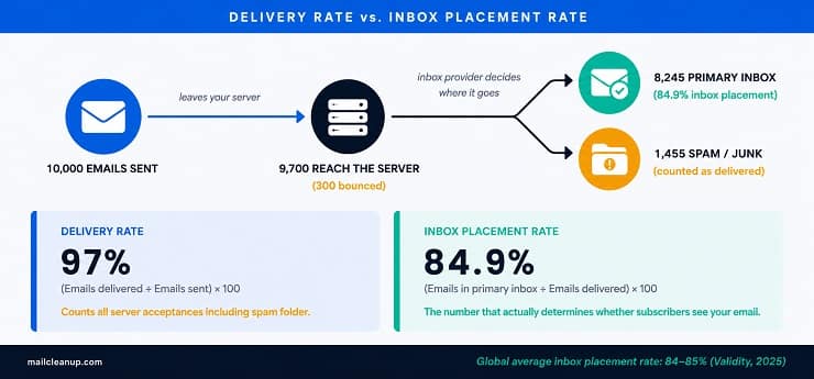
Delivery Rate vs. Inbox Placement Rate
These two are treated as the same email marketing KPI by most senders. They are meaningfully different, and conflating them will give you false confidence about your deliverability.
Delivery rate measures the percentage of emails your sending server successfully handed off to a receiving mail server. An email that lands in the spam folder is counted as delivered. An email filtered automatically into the promotions tab is counted as delivered. Delivery rate tells you whether your emails left your server and were accepted by the recipient’s server. Nothing more.
Inbox placement rate measures the percentage of delivered emails that actually reached the primary inbox rather than spam, junk, or a filtered tab. This is the email marketing KPI that determines whether a subscriber can see your email at all. According to Validity’s 2025 Email Deliverability Benchmark Report, the global average inbox placement rate sits at 84 to 85%, with top performers reaching 90% or above. That means roughly one in six emails from the average sender is landing somewhere other than the primary inbox.
Your ESP reporting dashboard will typically surface delivery rate automatically. Inbox placement rate requires a separate placement test, which most ESPs do not surface without a dedicated inbox testing tool.
Benchmark targets:
| Metric | Target | Action Needed |
|---|---|---|
| Delivery rate | Above 98% | Below 95% requires immediate investigation |
| Inbox placement rate | Above 90% | 84 to 85% is average; below 80% is a deliverability emergency |
What drives a low inbox placement rate: weak email sender reputation, missing or misconfigured SPF, DKIM, or DMARC authentication, sending to unverified or disengaged lists, and high spam complaint rates. Every one of these is diagnosable and fixable.
Email Bounce Rate
Email bounce rate is the percentage of emails that could not be delivered to their intended recipient. It is one of the most important email marketing key metrics for diagnosing list quality problems before they compound into serious deliverability damage.
There are two categories. Hard bounces are permanent delivery failures: the address does not exist, the domain is invalid, or the recipient’s server has blocked your sending domain. Soft bounces are temporary failures: a full inbox, a server that was temporarily offline, or a message that exceeded the recipient server’s size limit. For a detailed breakdown of what causes each type and how ESP handling differs between them, see our guide on soft bounce vs hard bounce.
Why bounce rate matters beyond the number itself:
A high hard bounce rate signals to inbox providers that you are sending to invalid or unverified addresses. This directly damages your sender reputation score and reduces inbox placement rates for all future sends, not just the campaign that generated the high bounce. The reputation damage is not isolated: inbox providers share signals, so a reputation hit with Gmail can affect placement with Outlook as well.
Benchmark targets by bounce rate level:
| Bounce Rate | What It Signals |
|---|---|
| Below 2% | Healthy list with standard maintenance in place |
| 2% to 5% | List quality issues present, verification run required |
| Above 5% | Active deliverability risk, immediate list audit required |
For a full breakdown of how bounce rate thresholds vary by sending scenario, campaign type, and list age, see our guide on acceptable email bounce rate.
Hard bounces must be removed from your list immediately after each campaign. Continuing to send to known hard bounce addresses signals poor list management to inbox providers and accelerates the reputation damage. For how to build a systematic process around this, our guide on email list hygiene covers the ongoing maintenance discipline in full.
Spam Complaint Rate
Spam complaint rate is the percentage of delivered emails that recipients marked as spam. It is the most undermonitored important email marketing KPI in bulk sending, and the threshold at which it becomes a problem is lower than most senders expect.
Formula: (Number of spam complaints / Number of emails delivered) x 100
Why this email marketing KPI carries more weight than its size suggests:
When someone marks your email as spam, that signal is shared directly with inbox providers through feedback loop programmes. Google Postmaster Tools and Microsoft’s SNDS give ISPs visibility into complaint rates at the sending domain level. A high complaint rate does not just affect the campaign that generated it. It damages your sender reputation for all future sends across all providers receiving those complaint signals.
Benchmark thresholds:
| Spam Complaint Rate | Status |
|---|---|
| Below 0.08% | Healthy |
| 0.08% to 0.1% | Caution zone; review recent content and list segmentation |
| Above 0.1% | Google Postmaster Tools flags this level; inbox placement begins to drop |
| Above 0.3% | Critical risk; blacklisting and blocked sending privileges are possible |

One complaint per 1,000 emails, which equates to 0.1%, is where major inbox providers begin active scrutiny of your sending. At 0.3%, you are at risk of having your sending privileges restricted by your ESP.
What drives a high spam complaint rate: sending to contacts who did not clearly opt in, poor segmentation pushing irrelevant content to the wrong audience, frequency fatigue from over-sending, and making the unsubscribe process difficult enough that recipients use the spam button instead. Lists that contain inactive or unverified addresses are a major contributor: disengaged contacts who have not opened or clicked in months are far more likely to mark a new campaign as spam than to actively unsubscribe.
List Growth Rate
List growth rate measures how quickly your subscriber list is growing after accounting for all losses. The formula is: new subscribers minus unsubscribes and removed bounces, divided by your total list size, multiplied by 100.
This is one of the email marketing key metrics that reveals the long-term health of your programme rather than individual campaign performance. A list that is shrinking signals that your acquisition is not keeping pace with natural attrition. A shrinking list will compress every other metric in the hierarchy over time because you are sending to a progressively smaller and often progressively older audience.
What a healthy rate looks like:
There is no single email marketing KPI benchmark for list growth that applies universally. The right growth rate depends on your acquisition channels, industry, and programme maturity. What matters more than the absolute number is direction and composition. A list growing at 8% per month by importing unverified cold contacts is a worse outcome than a list growing at 3% per month through a double opt-in signup flow. The former will generate bounce rate and complaint rate problems that undo the apparent growth.
List growth rate should always be read alongside bounce rate and spam complaint rate as a combined Tier 1 picture. Growth in isolation does not tell you whether the list is becoming more or less healthy.
Tier 2: Email Marketing Engagement KPIs
Tier 2 is where most senders spend most of their analytical attention. Open rate, click-through rate, click-to-open rate, and unsubscribe rate are the numbers that dominate campaign reports and weekly performance reviews. They are genuinely useful signals when read correctly. The problem is that each one of them has a blind spot that becomes a serious issue when the metric is treated as a straightforward indicator of how well your programme is working.
This section covers what each Tier 2 email marketing KPI actually measures, where each one misleads, and how to read them together rather than in isolation.
Open Rate
Open rate is the percentage of delivered emails that were opened. It has been the default headline email marketing KPI for most senders for over a decade, and it is currently the most misread metric in email marketing analytics.
Formula: (Unique opens / Emails delivered) x 100
The MPP problem, explained clearly:
Apple Mail Privacy Protection launched in September 2021. When a subscriber uses Apple Mail on an iOS, iPadOS, or macOS device with MPP enabled, Apple’s servers prefetch all email content including tracking pixels before the subscriber ever opens the message. Your ESP registers a tracking pixel fire and records an open. The subscriber may never have read the email.
By early 2025, Apple Mail accounts for roughly 58% of all email opens globally according to Litmus data. This means the majority of the opens recorded in your reporting dashboard for a significant portion of your list are machine-generated opens that bear no relationship to actual subscriber behaviour. A sender whose list is heavily Apple Mail users could see a reported open rate of 45% while their genuine read rate is closer to 22%.
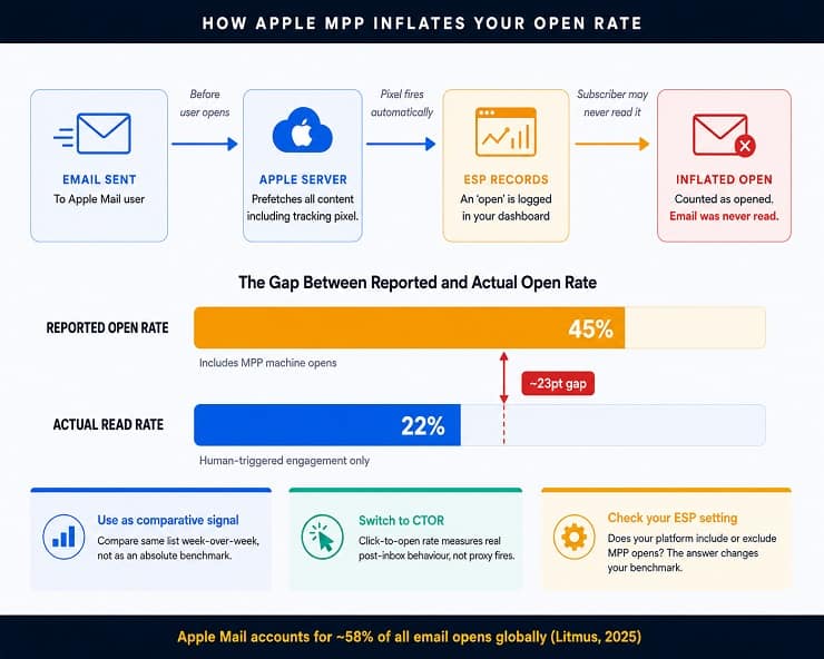
This is the exact problem the previous version of this post contained: open rate listed as a primary email marketing KPI without this context. That framing is factually misleading for any sender with a meaningful proportion of Apple Mail subscribers, which in 2025 means practically every sender.
What open rate is still useful for:
Open rate is not worthless. It still provides signal in two specific contexts. First, it works as a comparative metric when you are sending to the same list in controlled conditions: if last week’s campaign to the same segment had a reported open rate of 38% and this week’s has 24%, something changed, and the comparison still points you toward a subject line, send time, or list segment problem worth investigating. Second, for senders whose lists are predominantly non-Apple Mail clients (certain B2B audiences using Outlook via corporate systems, for example), open rate distortion is lower and the metric is more meaningful as an absolute figure.
Outside those two contexts, open rate should not be your primary email marketing KPI for campaign performance. Use it as a directional signal, not a definitive measure.
Benchmark context (with MPP distortion noted):
| Source | Cross-industry average open rate |
|---|---|
| MailerLite (2025 data, 3.6M campaigns) | 43.46% |
| ActiveCampaign (2025 data, 3.3M campaigns) | 42.35% |
| WebFX (Mailchimp data, MPP-adjusted estimate) | 19.21% |
| Validity 2025 Deliverability Benchmark | Pre-MPP adjusted rate approximately 21 to 22% |
The divergence between these figures comes almost entirely from whether MPP opens are included or excluded. MailerLite and ActiveCampaign include them by default. WebFX and Validity attempt to strip them out. Neither approach is wrong, but comparing your open rate against a benchmark without knowing which methodology that benchmark used will give you a meaningless comparison. Always check whether the benchmark source includes or excludes MPP opens before deciding where you stand.
A practical open rate target for most senders: if your ESP includes MPP opens, 35% or above is solid for most industries. If MPP opens are excluded from your reporting, 20 to 25% is a healthy target for broadcast campaigns, rising to 30 to 40% for well-segmented or triggered sends.
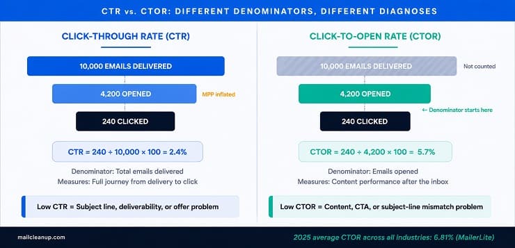
Click-Through Rate
Click-through rate is the percentage of delivered emails where at least one link was clicked. This is the email marketing KPI that most reliably reflects whether your email content generated enough interest to move the reader to act, and it is not distorted by MPP because clicks require actual human interaction.
Formula: (Unique clicks / Emails delivered) x 100
Why CTR is more reliable than open rate as an email marketing KPI:
A click cannot be prefetched by a proxy server. When someone clicks a link in your email, that is a deliberate action. CTR therefore gives you a cleaner picture of genuine engagement than open rate, particularly post-MPP. This is why most email marketing analytics guidance since 2021 has shifted toward CTR as the primary engagement indicator for campaign-level performance.
CTR is directly affected by three things: how relevant the content is to the segment receiving it, how clearly the call to action communicates what happens next, and whether the email is rendering properly across the devices your audience is using.
Benchmark targets:
| CTR level | What it signals |
|---|---|
| Below 1% | CTA clarity, content relevance, or mobile rendering issue |
| 1% to 2% | Below average; review segmentation and offer strength |
| 2% to 3.5% | Solid performance for most industries |
| Above 3.5% | Strong engagement; well-targeted content or compelling offer |
The cross-industry average CTR sits at approximately 2 to 2.6% across major benchmark reports, with B2B senders typically landing at the lower end of that range and nonprofit and government senders consistently above it. Ecommerce CTR tends to sit around 1.5 to 2%, compensating with volume and promotional urgency rather than per-click engagement depth.
For a practical view of how email sender reputation feeds into whether your emails even reach the inbox before CTR can be measured, our guide covers the full mechanism.
Click-to-Open Rate
Click-to-open rate is clicks expressed as a percentage of opens rather than total deliveries. It is the most reliable Tier 2 email marketing KPI for measuring how well your content performs once someone is inside the email, and it is the metric that has gained the most ground since MPP made open rate unreliable as an absolute benchmark.
Formula: (Unique clicks / Unique opens) x 100
Why CTOR matters as a distinct email marketing KPI:
CTR tells you how many people acted relative to the total you sent to. CTOR tells you how many of the people who opened acted. The two metrics answer different questions. A low CTR alongside a high CTOR tells you your content is working but your subject line is failing to get enough people into the email in the first place. A high CTR alongside a low CTOR tells you you are getting opens but your content or CTA is not closing the loop. CTOR diagnoses the content layer; CTR diagnoses the full funnel from delivery to action.
Post-MPP, CTOR still inherits some noise from inflated open counts in the denominator. However, since the inflation is consistent across campaigns sent to the same list, CTOR remains a more reliable campaign-over-campaign comparison than open rate alone.
Benchmark target:
The 2025 cross-industry average CTOR sits at approximately 6.8% based on MailerLite data. A target of 10 to 15% is what high-performing senders with well-segmented lists achieve on a consistent basis.
A declining CTOR trend across campaigns, even when CTR looks stable, often signals content fatigue in a segment. It is an early warning sign worth catching before unsubscribe rate reflects the same problem.
Unsubscribe Rate
Unsubscribe rate is the percentage of delivered emails that resulted in the recipient opting out. It is the email marketing KPI that most directly reflects whether your content is meeting the expectations your subscribers had when they signed up.
Formula: (Unsubscribes / Emails delivered) x 100
How to read this email marketing KPI correctly:
A low unsubscribe rate is not always a positive signal. It can mean your content is highly relevant and your list is healthy. It can also mean unengaged subscribers have stopped bothering to unsubscribe and are simply ignoring your emails, which is a different problem entirely. When unsubscribe rate drops while open rate and CTR also fall, the list has likely shifted into passive disengagement rather than active satisfaction.
A sudden spike in unsubscribe rate tells you something specific changed: the content was significantly off-target for that segment, frequency increased beyond what subscribers consented to, or a new list source introduced subscribers who did not clearly opt in.
Benchmark targets:
| Unsubscribe Rate | Status |
|---|---|
| Below 0.08% | Excellent; strong content-audience fit |
| 0.08% to 0.2% | Healthy; standard range for most programmes |
| 0.2% to 0.5% | Caution; frequency, relevance, or list source review needed |
| Above 0.5% | Critical signal requiring immediate segmentation and content audit |
One important change in 2025 affects how unsubscribe rate should be interpreted: Gmail made it significantly easier for recipients to unsubscribe directly from the inbox, without opening the email, using a one-click unsubscribe button next to any mass send. MailerLite’s 2025 data shows the cross-industry average unsubscribe rate more than doubled to 0.22%, largely attributed to this Gmail change. This means historical unsubscribe rate baselines from before mid-2024 are not directly comparable to current numbers for any programme with a significant Gmail audience.
Unsubscribe rate should also always be read alongside spam complaint rate. If spam complaints are rising while unsubscribe rate is low, subscribers are using the spam button rather than the unsubscribe link, which is a worse outcome for your deliverability than a high unsubscribe rate would be.
Tier 3: Revenue and Business Email Marketing KPIs
Tier 3 is where email marketing justifies itself to leadership. Engagement metrics describe behaviour. Revenue and business KPIs describe outcomes. These are the email marketing key metrics that answer the question: is this programme generating value proportionate to the investment it requires?
Most reporting dashboards make Tier 3 email marketing KPIs harder to access than Tier 1 or Tier 2 metrics because they require connecting email activity data to conversion and revenue data from outside the ESP. That additional step is worth taking. Without it, you are managing the email channel by engagement proxies rather than by the business results it is actually producing.

Conversion Rate
Conversion rate is the percentage of email recipients who completed a defined desired action after clicking through from your email. A conversion can be a purchase, a form submission, a free trial signup, a demo booking, an event registration, or any other specific outcome you have designated for that campaign.
Formula: (Conversions / Emails delivered) x 100
Why this email marketing KPI requires a precise definition upfront:
The conversion definition must be set before the campaign goes out, not after you see the results. Changing the definition retroactively to capture a broader action than originally intended inflates the metric and undermines the programme’s credibility with stakeholders. If your campaign goal was purchases, page views do not count as conversions for that send.
Conversion rate is the email marketing KPI that most directly connects Tier 2 engagement signals to Tier 3 business outcomes. A campaign with a 4% CTR and a 0.3% conversion rate has a serious landing page or offer problem that click-through rate alone would never surface. The gap between click-through rate and conversion rate is where most revenue leakage in email programmes actually sits.
What affects conversion rate:
How relevant the post-click experience is to the email promise matters as much as the email content itself. A strong subject line and compelling body copy that lands the recipient on a slow-loading or poorly structured landing page will produce a low conversion rate regardless of how well the email performs in Tier 2. Conversion rate is therefore a cross-functional email marketing KPI: it reflects email performance and landing page performance together.
Benchmark context:
The average email marketing conversion rate sits at approximately 1 to 3% for most campaign types, with ecommerce promotional sends at the lower end and highly segmented lifecycle emails (abandoned cart, re-engagement) performing significantly higher depending on the audience and offer.
For context on how email segmentation practices affect conversion rates at scale, see our guide on how to clean email lists, which covers how address-level data quality connects to engagement and conversion performance.
Revenue Per Email and Email ROI
These two email marketing KPIs are treated separately in most guides. In practice they answer the same question from different angles, and they are most useful when tracked together.
Revenue per email (RPE) measures the average revenue generated for each email delivered in a campaign. It strips away engagement metrics and connects sending activity directly to financial output.
Formula: Total revenue attributed to the campaign / Number of emails delivered
Email ROI measures the return on the total investment in the email programme relative to the revenue it generates.
Formula: ((Revenue generated minus total costs) / Total costs) x 100
Total costs include the ESP platform fee, any content creation costs, design time, any list management tooling, and staff time attributed to the programme. Excluding any of these inflates ROI and makes the number misleading.
Why tracking both matters as a combined email marketing KPI picture:
RPE can look strong on a campaign-by-campaign basis while programme-level ROI is eroding if costs are rising faster than revenue. Conversely, a low RPE on a nurture campaign that feeds into a high-value conversion sequence later in the funnel is not a performance failure; it is part of a multi-step revenue mechanism that single-campaign attribution will not capture. Reading both metrics at the campaign level and the programme level gives you a more accurate picture than either alone.
Benchmark context:
Litmus research places the average email marketing ROI at $36 returned for every $1 spent across industries. Omnisend data for ecommerce senders reports higher figures closer to $76 per dollar spent, reflecting the high purchase-intent audiences that ecommerce email programmes typically work with. These are industry-wide averages and vary significantly by programme maturity, list quality, and sending sophistication. Use them as orientation, not targets.
Subscriber Lifetime Value
Subscriber lifetime value is the total revenue a subscriber generates for your business over the duration of their time on your list. It is the email marketing KPI that most directly justifies list acquisition investment and long-term programme health decisions.
Why this email marketing KPI changes how you think about your programme:
When you know the average lifetime value of a subscriber, you can calculate how much you should be willing to spend to acquire one. You can also make better decisions about re-engagement campaigns: if the average subscriber generates significant revenue over 18 months, investing in a four-email win-back sequence for inactive subscribers is quantifiably worthwhile rather than a matter of intuition.
Subscriber lifetime value also reframes the cost of a dirty list. An invalid address is not just a bounce that costs you one send. It represents a subscriber slot occupied by a dead address that generates no revenue while contributing to deliverability damage that suppresses revenue from the rest of the list. When you connect list quality to subscriber lifetime value, the business case for regular list verification becomes straightforward.
How to calculate it:
Start with the average revenue per email for your programme. Multiply by the average number of campaigns a subscriber receives before churning. Add any additional revenue from repeat purchases, referrals, or upsells attributable to email-driven relationships. The result is an approximation of subscriber lifetime value that becomes more accurate as your programme matures and you accumulate more historical data.
There is no meaningful cross-industry email marketing KPI benchmark for subscriber lifetime value because it depends entirely on your product, pricing, purchase frequency, and churn rate. Set your own baseline and track direction over time.
Email Marketing Benchmarks: What Good Looks Like in 2026
Before reading any email marketing benchmarks table, there is one thing you need to understand: the number you see depends almost entirely on where that number came from. Email marketing benchmarks published by different platforms vary so sharply that comparing your performance against the wrong source will lead you to completely wrong conclusions about where your programme stands.
MailerLite’s 2025 cross-industry open rate average is 43.46%, drawn from over 3.6 million campaigns. WebFX, using Mailchimp data with MPP-adjusted estimates, reports 19.21%. Both numbers are being reported honestly. The divergence exists because MailerLite’s data includes MPP machine opens by default while the adjusted Mailchimp figure attempts to strip them out. Neither is the definitive email marketing benchmark. They are measuring different things using the same metric label.
This is why your own historical baseline is a more useful reference point than any cross-industry average for most email marketing key metrics. If your open rate was 29% last quarter and is 22% this quarter for the same segment, you have a real signal to investigate regardless of where industry benchmarks land. If your spam complaint rate was 0.05% consistently and has moved to 0.12%, that trend matters more than the fact that 0.12% is still cited as acceptable by some benchmark reports.
Use the table below as orientation for where your programme sits, with the understanding that all figures reflect 2025 to 2026 data across major platform datasets and that open rate figures in particular should be read against your own ESP’s MPP inclusion settings before drawing conclusions.
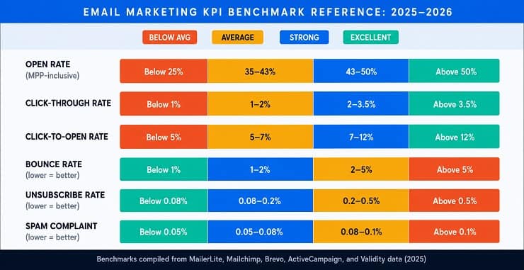
Email Marketing KPI Benchmark Reference Table (2025 to 2026)
| Email Marketing KPI | Below Average | Average | Strong | Excellent |
|---|---|---|---|---|
| Open rate (MPP-inclusive) | Below 25% | 35 to 43% | 43 to 50% | Above 50% |
| Open rate (MPP-adjusted) | Below 15% | 18 to 22% | 22 to 30% | Above 30% |
| Click-through rate | Below 1% | 1 to 2% | 2 to 3.5% | Above 3.5% |
| Click-to-open rate | Below 5% | 5 to 7% | 7 to 12% | Above 12% |
| Conversion rate | Below 0.5% | 1 to 2% | 2 to 3.5% | Above 3.5% |
| Bounce rate | Above 5% | 2 to 5% | 1 to 2% | Below 1% |
| Unsubscribe rate | Above 0.5% | 0.2 to 0.5% | 0.08 to 0.2% | Below 0.08% |
| Spam complaint rate | Above 0.3% | 0.1 to 0.3% | 0.05 to 0.1% | Below 0.05% |
| Inbox placement rate | Below 80% | 80 to 85% | 85 to 92% | Above 92% |
| List growth rate | Negative or flat | 1 to 3% monthly | 3 to 8% monthly | Above 8% monthly |
One more important caveat on reading email marketing benchmarks: the averages above include senders at every level of sophistication, from programmes with strong segmentation and verified lists to programmes sending broadcast campaigns to unmanaged lists built over years. The upper end of each range reflects what well-run programmes achieve, which is the more useful reference point for a sender actively working to improve performance.
Email Marketing Benchmarks by Industry
Email marketing benchmarks by industry vary significantly, and applying a cross-vertical average to your performance will tell you very little when your industry has its own typical patterns. A nonprofit consistently achieving a 45% open rate is not outperforming an ecommerce sender at 35%: they are operating in different environments with different audience relationships and different sender-recipient dynamics.
The email marketing metrics by industry table below consolidates data from MailerLite, Mailchimp, Brevo, Klaviyo, and ActiveCampaign benchmark reports across 2024 and 2025. Open rate figures reflect platform-native reporting which includes MPP opens unless otherwise specified. Use them to compare against your own industry peer group rather than the overall cross-industry average.

Email Marketing Benchmarks by Industry (2025 Data)
| Industry | Avg Open Rate | Avg CTR | Avg Bounce Rate | Avg Unsubscribe Rate |
|---|---|---|---|---|
| Ecommerce | 37 to 40% | 1.5 to 2% | 2 to 3% | 0.2 to 0.3% |
| B2B / Professional services | 38 to 42% | 2.5 to 4% | 1.5 to 2.5% | 0.1 to 0.2% |
| SaaS / Technology | 36 to 40% | 2 to 3% | 2 to 3% | 0.15 to 0.25% |
| Nonprofit | 42 to 48% | 3 to 4% | 1.5 to 2.5% | 0.05 to 0.1% |
| Education | 38 to 44% | 2.5 to 3.5% | 2 to 3% | 0.1 to 0.2% |
| Healthcare | 36 to 42% | 2 to 3% | 2 to 3.5% | 0.1 to 0.2% |
| Finance and insurance | 35 to 40% | 2 to 2.5% | 2 to 3% | 0.1 to 0.15% |
| Government and public sector | 40 to 46% | 4 to 5% | 1.5 to 2% | 0.05 to 0.1% |
| Retail | 34 to 38% | 1.5 to 2% | 2.5 to 3.5% | 0.2 to 0.35% |
| Agency and creative services | 35 to 40% | 2 to 3% | 2 to 3% | 0.25 to 0.4% |
Reading email marketing benchmarks by industry correctly:
Several patterns are worth noting in this data. Government and nonprofit consistently lead on CTR because their audiences have a clear interest relationship with the sender and content tends to be action-oriented and specific. Ecommerce and retail show lower CTR despite high-frequency sending because list segments are broader and purchase-intent varies significantly across the list. B2B professional services achieves higher CTR than ecommerce despite lower send frequency because audiences are receiving content directly relevant to their work and decisions.
Email marketing metrics by industry also diverge significantly on bounce rate. Industries with formal signup processes and verified data at collection (healthcare, finance, government) maintain cleaner lists by default. Industries with high-volume acquisition through contests, gated content, or third-party data (retail, ecommerce) tend to accumulate more invalid addresses over time, which shows up directly in bounce rate.
If your email marketing analytics show you consistently below the range for your vertical in both CTR and bounce rate simultaneously, the most likely root cause is list quality rather than content or strategy. A list carrying a significant proportion of invalid, inactive, or catch-all addresses will drag down engagement metrics even when the content and segmentation are well-executed.
How to Choose Your Email Marketing KPIs Based on Your Goal
The most common mistake in email marketing analytics is tracking all available metrics without prioritising the ones connected to your current goal. Every email programme has a dominant challenge at any given point in its development. The email marketing KPI you focus on should reflect that challenge directly.
The goal-based framework below maps four common programme goals to the KPIs that most directly reflect progress toward each one, the secondary metrics to watch as supporting signals, and the metrics you can deprioritise without missing important information.
Goal 1: Improve deliverability and inbox placement
| Priority | KPIs |
|---|---|
| Primary email marketing KPI | Inbox placement rate, spam complaint rate |
| Secondary signals | Bounce rate, delivery rate |
| Deprioritise for now | Open rate, CTR |
When your emails are not reaching inboxes reliably, engagement metrics cannot improve regardless of content quality. Fix the foundation before optimising the upper layers. Start with a full email authentication check (SPF, DKIM, DMARC), run a list verification pass, and monitor spam complaint rate per campaign until it is consistently below 0.1%.
Goal 2: Increase engagement with your audience
| Priority | KPIs |
|---|---|
| Primary email marketing KPI | CTOR, CTR |
| Secondary signals | Unsubscribe rate, open rate (as comparative signal only) |
| Deprioritise for now | Revenue per email, ROI |
CTOR is the single most useful important email marketing KPI for diagnosing content performance because it isolates the content layer from the deliverability and subject line layers. If CTOR is strong but CTR is low, your subject lines are the problem. If CTOR is weak despite a decent open rate, your content or CTA is failing to connect with what the subject line promised.
Goal 3: Grow and maintain a healthy list
| Priority | KPIs |
|---|---|
| Primary email marketing KPI | List growth rate, bounce rate |
| Secondary signals | Unsubscribe rate, spam complaint rate |
| Deprioritise for now | Open rate, revenue per email |
List growth without list quality monitoring will produce a programme that looks like it is growing while its deliverability infrastructure erodes underneath. Track new subscriber sources alongside growth rate: a list growing through unverified imports will inflate the growth rate number while producing bounce and complaint rate problems within one or two sends. Our guide on email list hygiene covers the maintenance discipline that keeps a growing list healthy over time.
Goal 4: Generate revenue from your email programme
| Priority | KPIs |
|---|---|
| Primary email marketing KPI | Conversion rate, revenue per email, ROI |
| Secondary signals | CTR, CTOR |
| Deprioritise for now | Open rate, list growth rate |
When your programme is mature enough to focus on revenue outcomes, engagement metrics become inputs rather than goals. A declining CTOR matters because it predicts a future drop in conversion rate. A rising CTR matters because it signals more subscribers entering the conversion funnel. The email marketing analytics layer shifts from measuring engagement as an end in itself to using engagement data to diagnose conversion funnel performance.
For a comprehensive view of how to build the strategy framework that connects these goals to your sending programme, see the email marketing guide.
How List Quality Affects Every Email Marketing KPI
Every important email marketing KPI in this guide is directly affected by the quality of the list you are sending to. This is the connection most measurement guides never draw, because most of them are written by tools that measure campaigns rather than tools that clean lists. The relationship is direct and it runs through every tier of the KPI Hierarchy.

At Tier 1:
A list carrying a significant proportion of invalid, expired, or unverified email addresses will produce hard bounces immediately. Hard bounce rate above 2% triggers inbox provider scrutiny and begins degrading your sender reputation. That reputation damage reduces your inbox placement rate for all future sends, including sends to your healthy subscribers. The list quality problem does not stay contained to the addresses that bounce: it spreads to the entire programme.
Lists that contain catch-all addresses (addresses at domains that accept all incoming email regardless of whether the mailbox exists) produce a subtler version of the same problem. They appear as deliveries in your ESP report, avoid your bounce rate, and then generate no engagement because the address is not connected to a real person. They occupy the denominator of every engagement rate calculation, making CTR, CTOR, and conversion rate look worse than they actually are for your real audience. Our guide on email verification features explained covers how catch-all detection works and why it matters for email marketing KPI accuracy.
At Tier 2:
When a portion of your list is made up of inactive or invalid addresses that technically deliver, every engagement rate suffers. Open rate, CTR, and CTOR are all calculated as a percentage of deliveries. Invalid addresses that deliver but never engage act as dead weight in the denominator of those calculations, dragging every metric down. A programme with 30% of its list as inactive or unverifiable addresses will report engagement KPIs that look structurally worse than a competitor sending to a smaller but fully verified list, even if the content quality is identical.
Beyond the mathematical drag, inactive addresses are a major driver of spam complaint rate. Subscribers who stopped engaging months ago and have forgotten they were on your list are significantly more likely to mark a new campaign as spam than to actively unsubscribe. A single poorly targeted campaign to a stale segment can push spam complaint rate above the 0.1% threshold in one send.
At Tier 3:
Conversion rate and revenue per email are both calculated against the full delivered volume. If a meaningful proportion of your delivered volume is going to addresses that will never convert, your Tier 3 KPIs will be systematically understated. The revenue your email programme is generating looks smaller than it actually is relative to your engaged, convertible audience because the invalid volume is inflating the denominator.
The practical connection:
Before optimising subject lines, redesigning templates, testing send times, or restructuring your segmentation, verify your list. Running a verification pass removes hard bounces before they damage your sender reputation, identifies catch-all addresses for separate treatment, surfaces disposable addresses that inflate your subscriber count without contributing any engagement, and removes risk addresses that are likely to generate spam complaints. Every KPI in every tier improves when the list is clean because the measurement is no longer being distorted by addresses that were never going to perform.
For a full walkthrough of how to execute a verification pass and what to do with each result category, see how to clean email lists and best email list cleaning service for tool options matched to different list sizes and budgets. If you are dealing with active spam trap exposure alongside standard list decay, our guide on what are spam traps covers how each trap type gets onto a list and what it signals about your acquisition and maintenance processes.
Your Email Marketing KPIs Are Only as Reliable as the List Behind Them
Every framework in this guide, the three-tier KPI Hierarchy, the goal-based selection map, the benchmark tables by industry, and the MPP context around open rate, gives you a more accurate picture of programme performance than the default reporting dashboard view. But none of it corrects for the one variable that distorts email marketing analytics at the source: a list that contains a significant proportion of addresses that were never going to deliver real results.
The best measurement approach in email marketing is not more metrics. It is cleaner inputs to the metrics you are already tracking. When every address in your list is verified, the bounce rate you see reflects actual sending behaviour rather than infrastructure decay. The engagement rates you report reflect your real audience rather than the diluted average of active subscribers and dead addresses combined. The ROI you report to stakeholders reflects what email is genuinely generating, not what it would generate if you stripped out the silent weight of addresses that have been sitting in your list unverified for two years.
Run your measurement framework. Track the KPIs that match your current goal. Read your benchmarks against your own baseline. And clean your list before the metrics tell you that you should have.
FAQs on Email Marketing KPIs & Metrics
What is the difference between an email marketing KPI and an email marketing metric?
An email marketing metric is any measurable data point from your campaign reports, such as opens, clicks, or bounces. An email marketing KPI is a metric you have tied to a specific business goal. Open rate is always a metric. It becomes a KPI when you decide it directly reflects progress toward a named objective and set a target for it.
Is open rate still a reliable email marketing KPI in 2026?
Open rate is unreliable as an absolute benchmark because Apple Mail Privacy Protection has inflated reported open rates since 2021. Apple Mail accounts for roughly 58% of all global email opens, meaning a large share of opens in most reports are machine-generated. Use open rate as a comparative signal across campaigns to the same list rather than as a standalone performance measure.
What is a good click-through rate for email marketing?
A click-through rate of 2 to 3.5% is solid performance for most industries based on 2025 benchmark data. B2B professional services and government senders typically land above this range, while ecommerce and retail senders tend to sit closer to 1.5 to 2%. Below 1% across multiple campaigns indicates a CTA clarity, content relevance, or mobile rendering issue that needs investigation.
What email marketing benchmarks should I use for my industry?
Use benchmark data from your specific vertical rather than cross-industry averages. Ecommerce senders should compare against ecommerce benchmarks (37 to 40% open rate, 1.5 to 2% CTR). B2B senders compare against B2B ranges (38 to 42% open rate, 2.5 to 4% CTR). More importantly, compare your current results against your own historical baseline, which is a more actionable signal than any external benchmark.
Why is spam complaint rate the most important email marketing KPI for bulk senders?
Spam complaint rate directly affects your sender reputation with inbox providers through shared feedback loop data. Exceeding 0.1%, which is roughly one complaint per 1,000 delivered emails, triggers scrutiny from Google and Microsoft. Above 0.3%, you risk blacklisting and restricted sending privileges. Unlike bounce rate, a high complaint rate damages deliverability for your entire programme, not just the campaign that generated it.
What is click-to-open rate and why is it a better engagement signal than open rate post-MPP?
Click-to-open rate measures clicks as a percentage of opens rather than total deliveries. It isolates content performance from subject line performance. Because clicks require real human action, CTOR is not distorted by Apple Mail Privacy Protection in the way open rate is. A target of 10 to 15% indicates well-targeted content. A declining CTOR trend across campaigns is an early warning sign of audience content fatigue.
How does list quality affect email marketing analytics results?
A list carrying invalid, inactive, or unverified addresses degrades every email marketing KPI simultaneously. Bounce rate rises and damages sender reputation. Spam complaint rate increases as disengaged contacts use the spam button. Engagement rates fall because invalid addresses inflate the denominator of every calculation. Conversion rate and ROI appear weaker than they actually are. A verification pass improves measurement accuracy across the entire KPI Hierarchy.
How do I calculate email marketing ROI correctly?
Email marketing ROI is calculated as: revenue generated minus total costs, divided by total costs, multiplied by 100. Total costs must include your ESP fee, content creation, design, list management tools, and proportional staff time. Excluding any cost component inflates the figure. Track ROI at both the individual campaign level and the programme level, as the two can diverge significantly when nurture campaigns feed high-value conversion sequences.